z

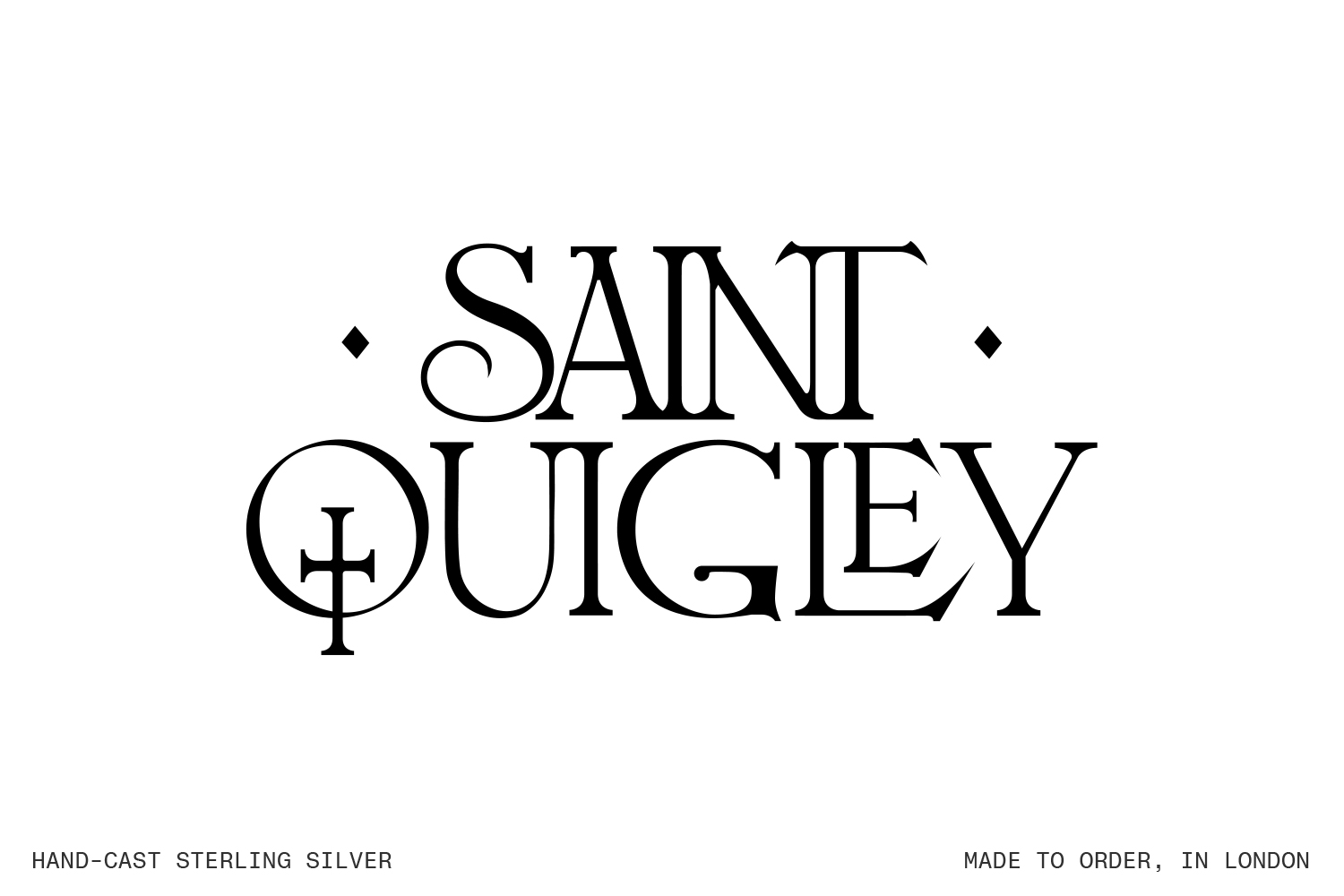

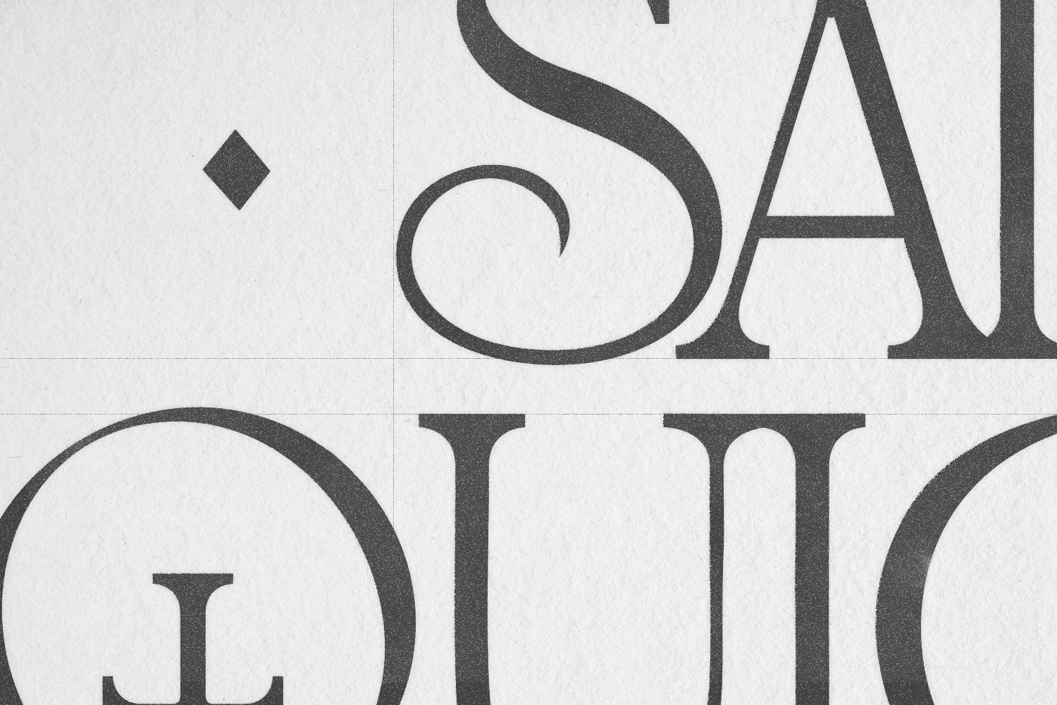
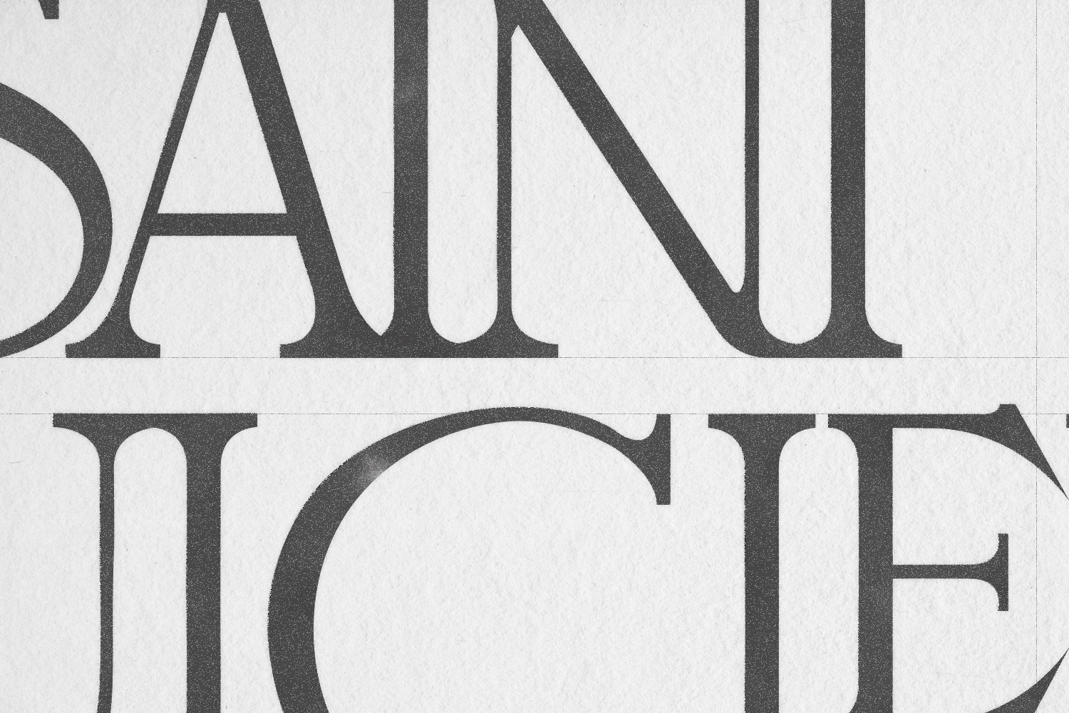
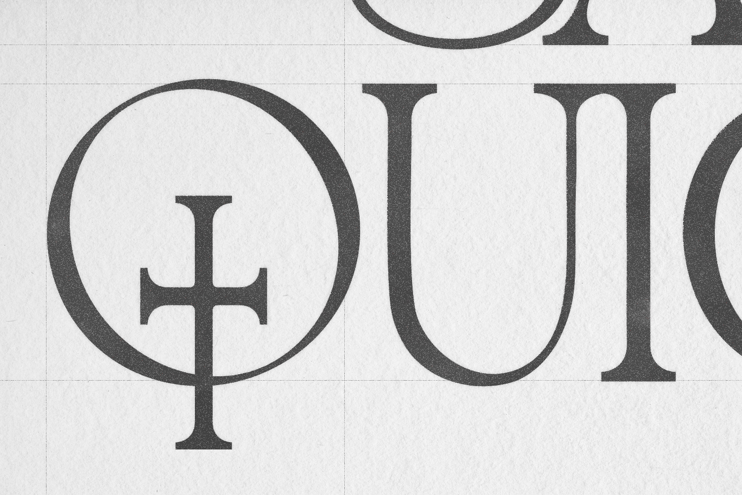


SAINT QUIGLEY | Wordmark Design
(Graphic Design, Branding, Typography)
Logo wordmark concept for the upcoming launch of jewellery brand, SAINT QUIGLEY.
The custom typography is based on Louis Jou’s early 20th century religious woodprints and hand-lettering.
(Graphic Design, Branding, Typography)
Logo wordmark concept for the upcoming launch of jewellery brand, SAINT QUIGLEY.
The custom typography is based on Louis Jou’s early 20th century religious woodprints and hand-lettering.


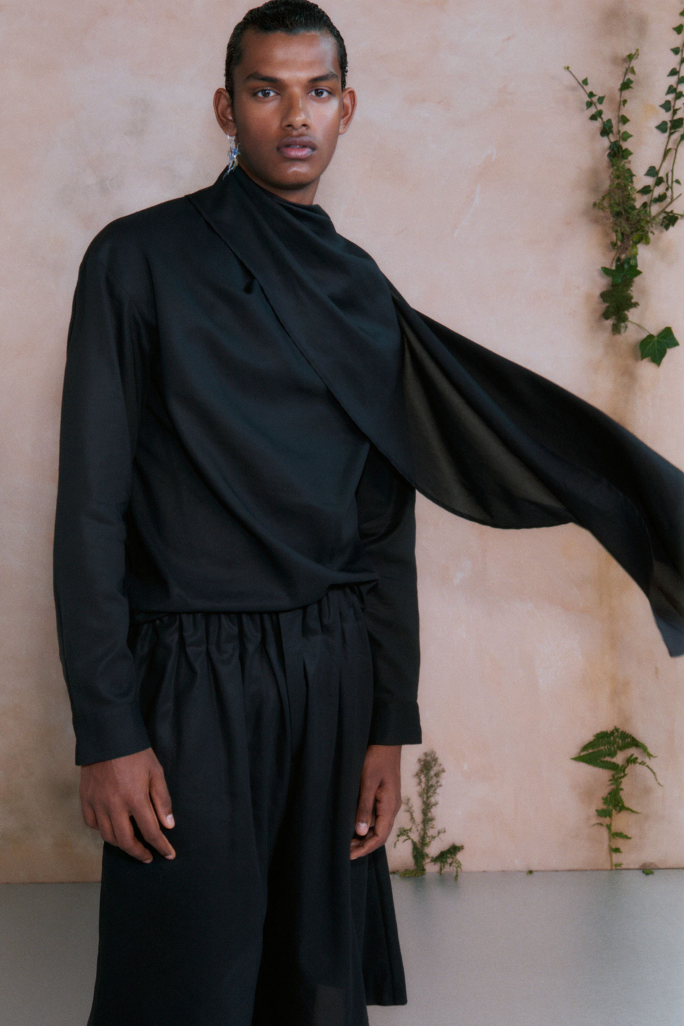
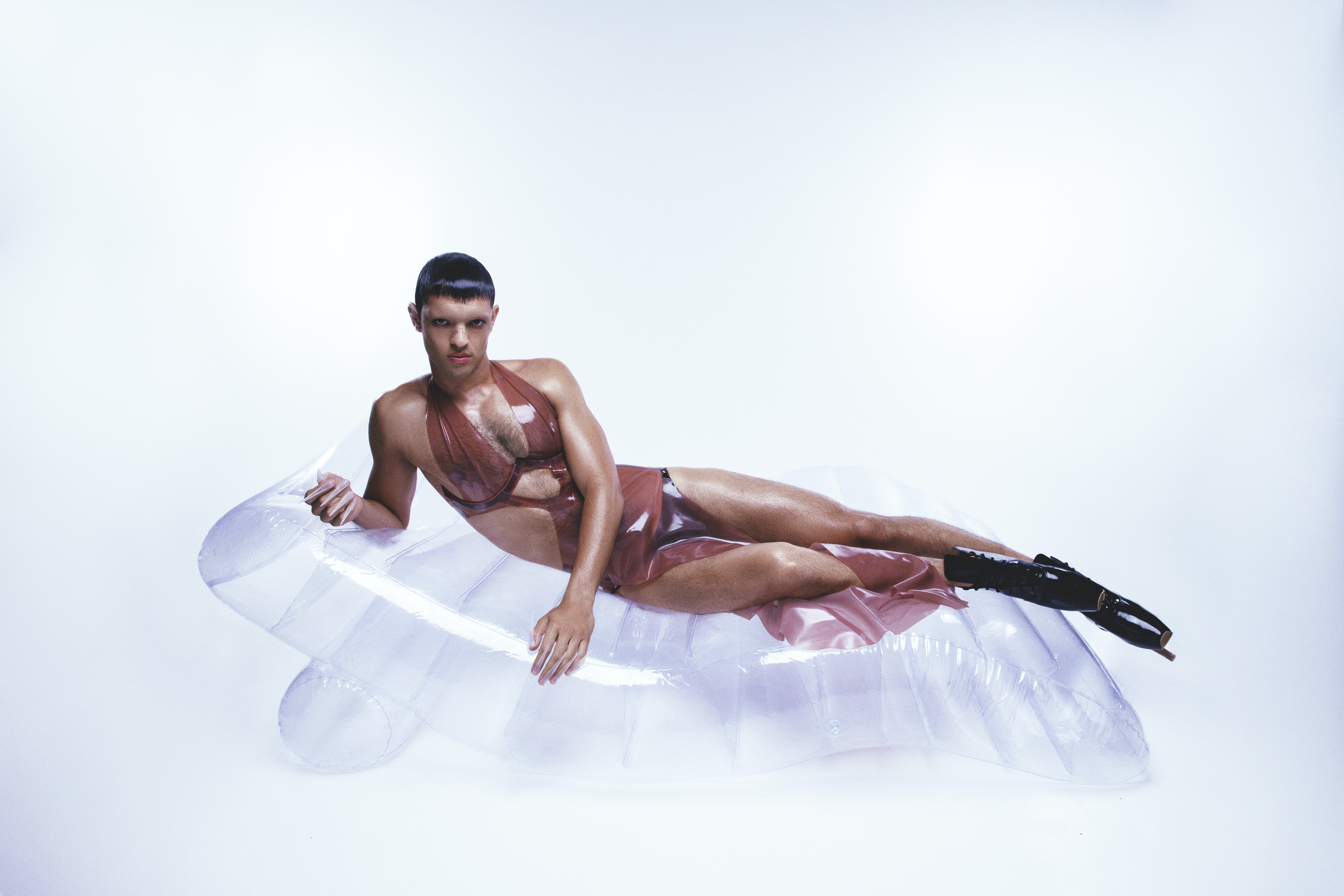
QASIMI SS25 | Campaign
(Assistant Art Director)
Contributed to the development of the concept and pitch decks that went to become Qasimi’s SS25 Campaign shoot under Olu Odukoya at OM O Creates.
(Assistant Art Director)
Contributed to the development of the concept and pitch decks that went to become Qasimi’s SS25 Campaign shoot under Olu Odukoya at OM O Creates.
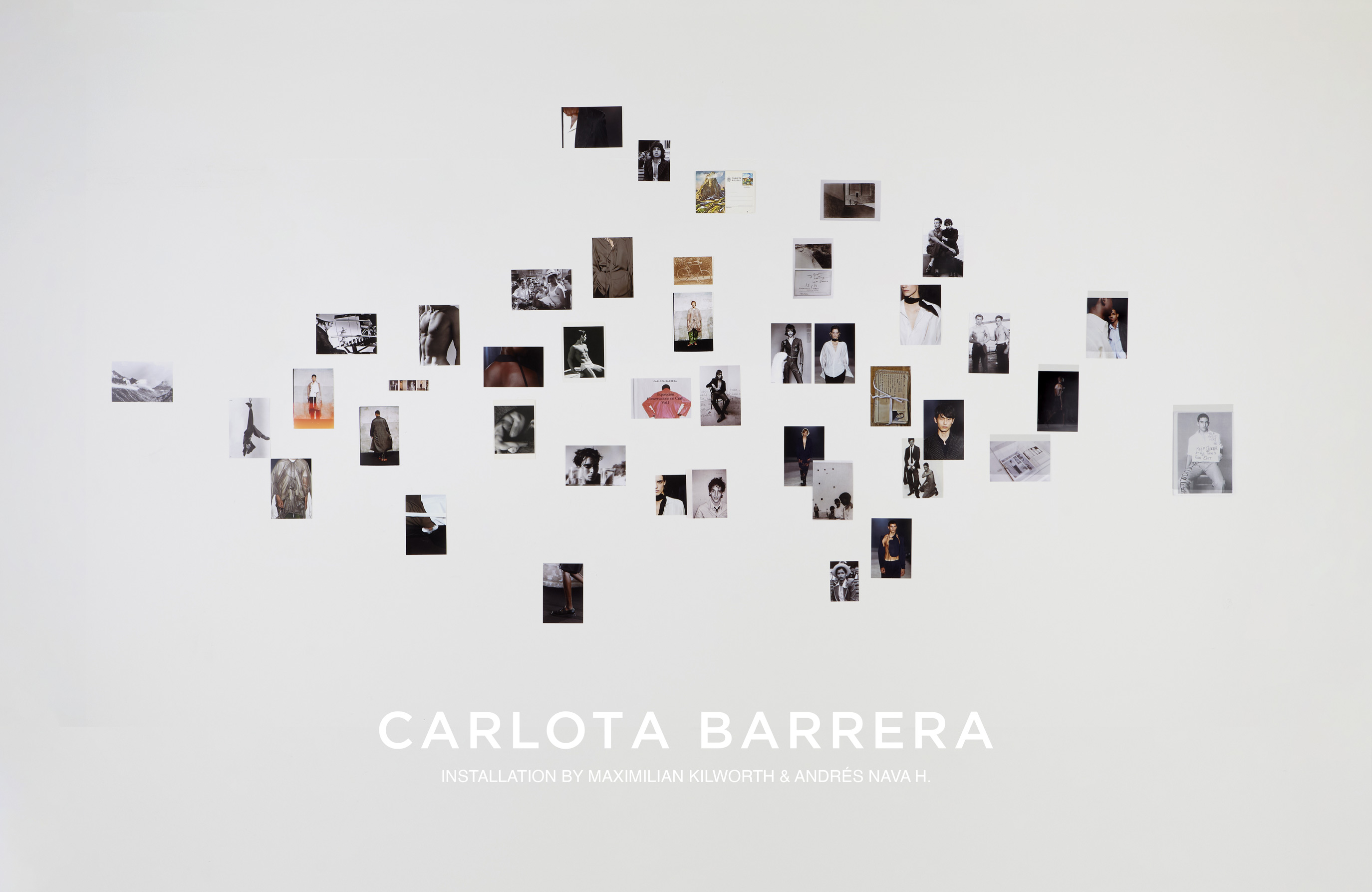
Carlota Barrera AW24 | Intallation
(Curation, Lighting, Photography)
Maximilian Kilworth & Andrés Nava Hurtado de-consturct and reinterpret Calota Barrera’s AW24 collection, highlighing the notions of tactically and craft within the collection’s process of becoming by repurposing elements from Barrera’s archive.
(Curation, Lighting, Photography)
Maximilian Kilworth & Andrés Nava Hurtado de-consturct and reinterpret Calota Barrera’s AW24 collection, highlighing the notions of tactically and craft within the collection’s process of becoming by repurposing elements from Barrera’s archive.
Carlota Barrera Visual Research
Andrés Nava H. Curation/Photography/Lighting
Maximilian Kilworth Art Direction/Curation
Andrés Nava H. Curation/Photography/Lighting
Maximilian Kilworth Art Direction/Curation
George Cabré Videography
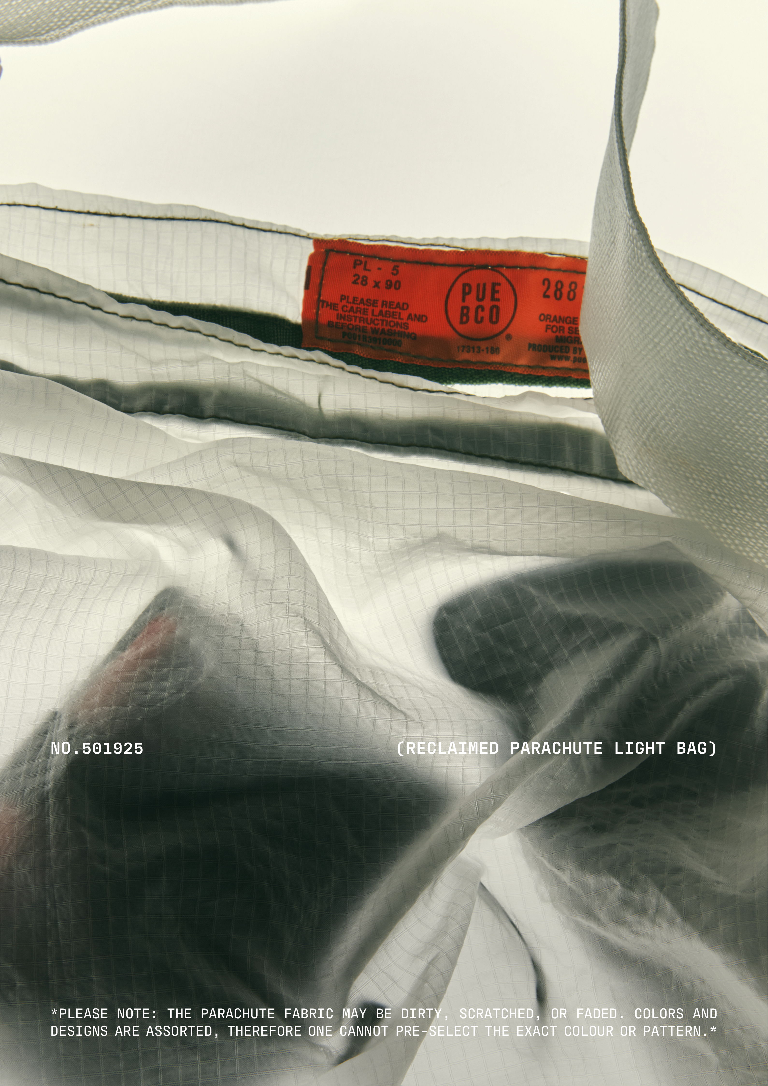
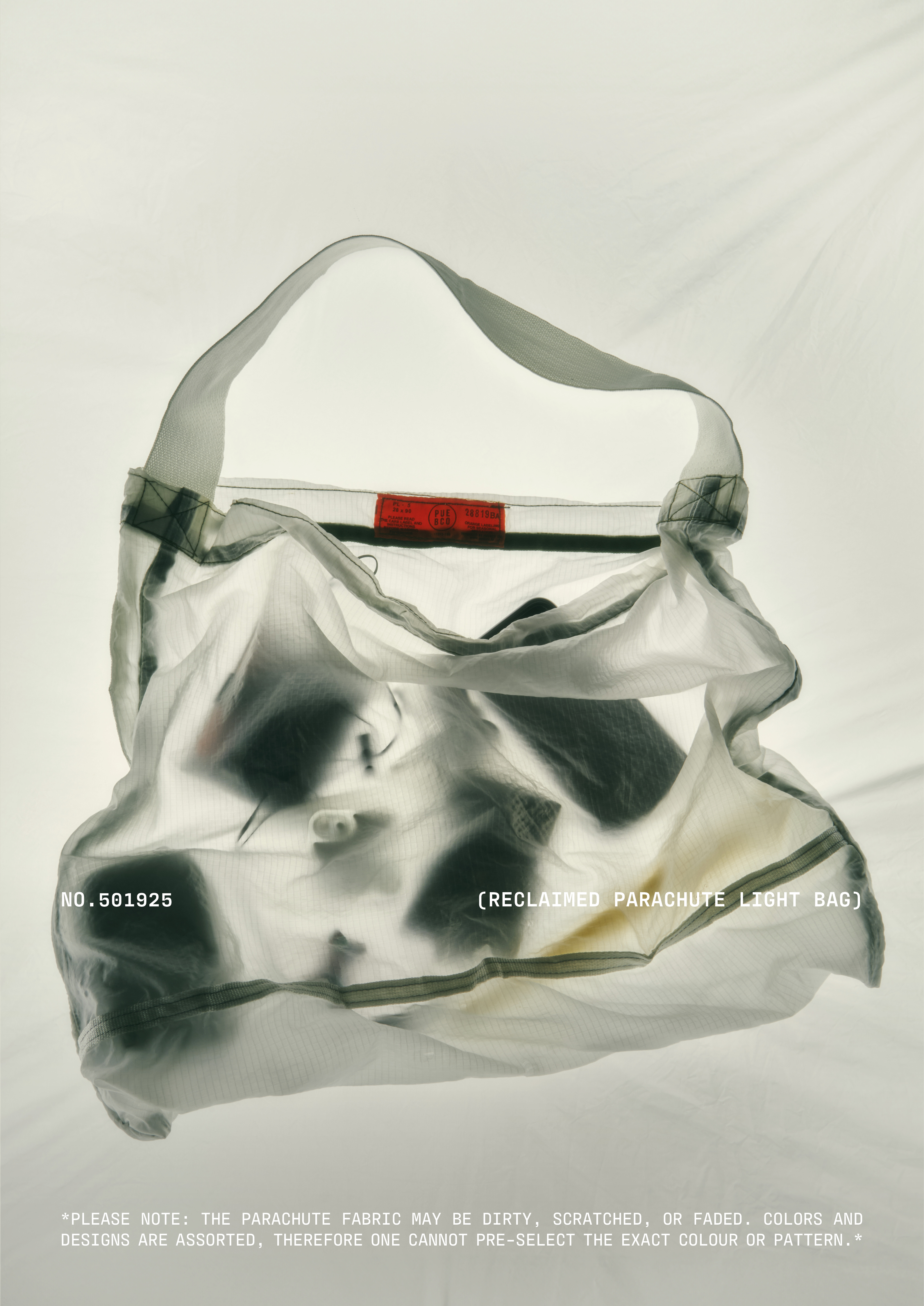
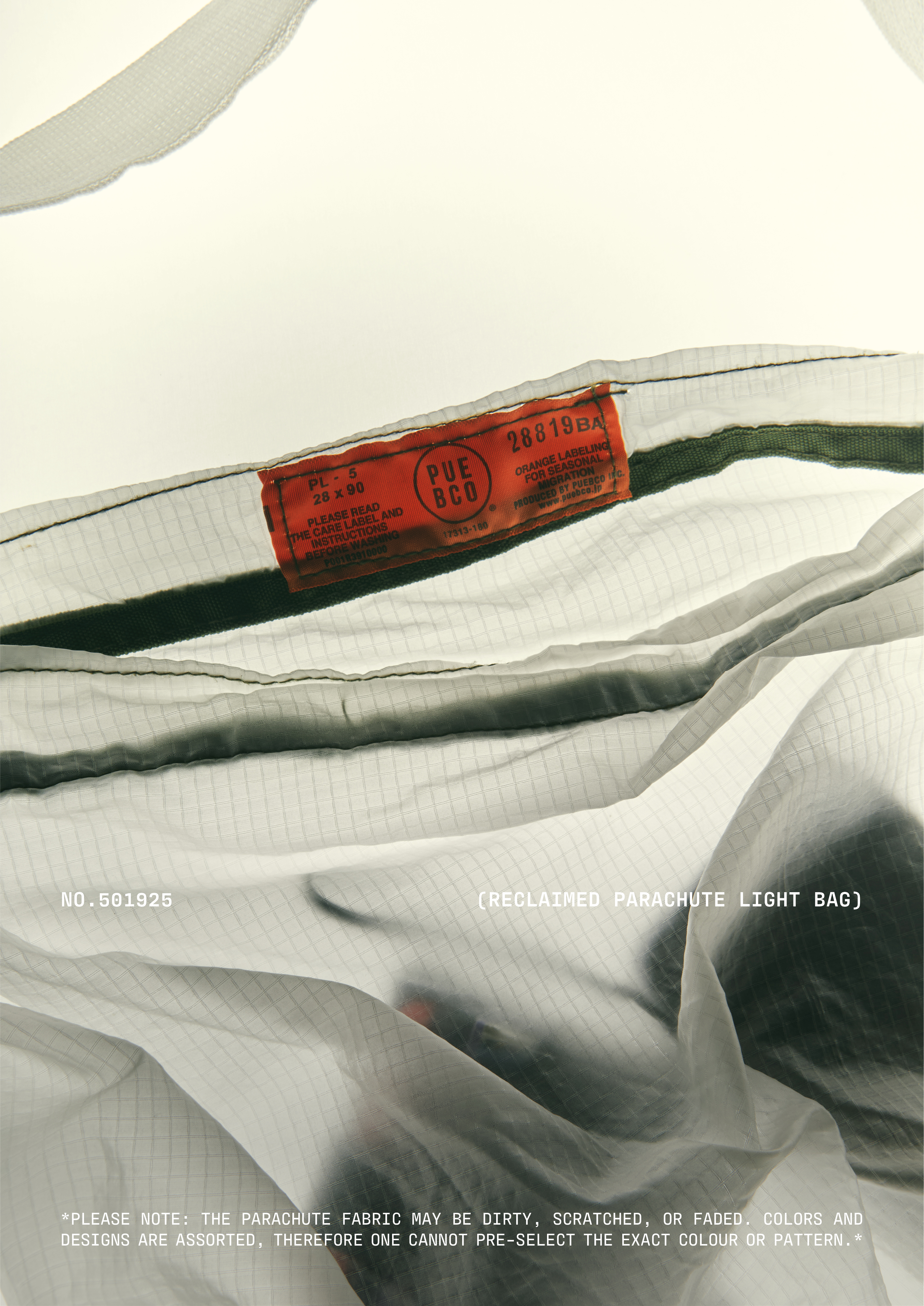
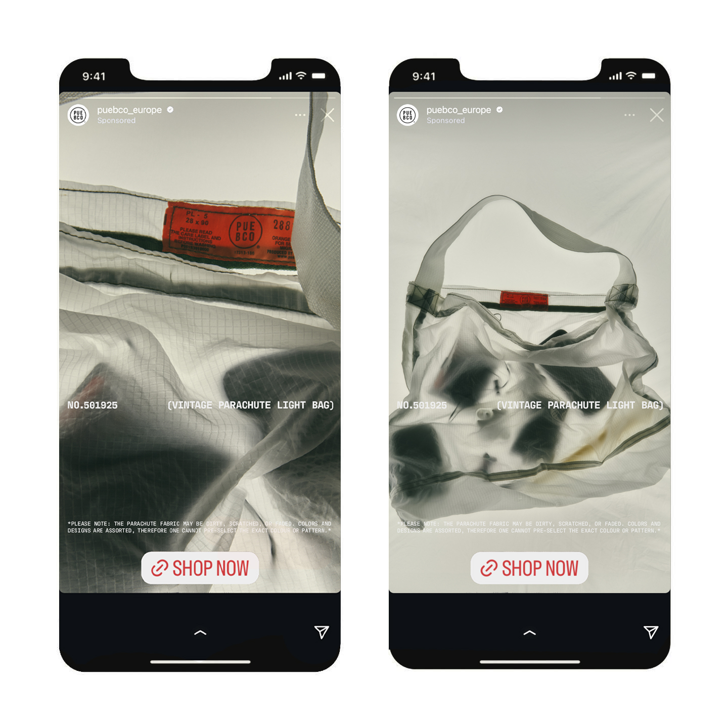
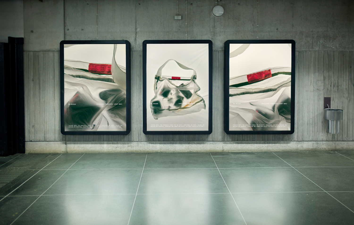
No. 501925 | Speculative Campaign Indentity for PUEBCO
(Campaign, Art Direction, Photography, Typography)
Reclaiming unique materials is at the heart of PUEBCO’s aproach to product design. Following that sentiment, this speculative campaign identity departs from the unique physical qualities of the reclaimed decomisioned parachure fabric that makes up PUEBCO’s Product No. 501925 (Vintage Parachute Light Bag) in order to communicate the spirit of the brand.
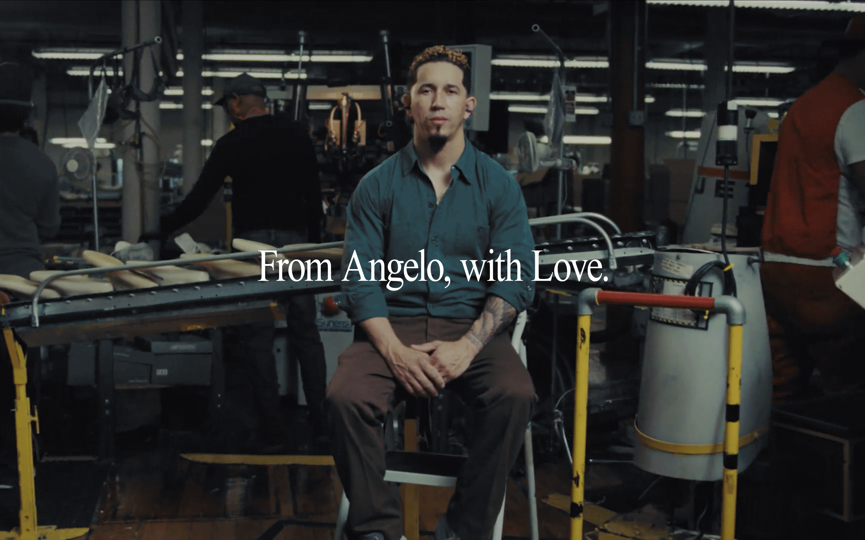

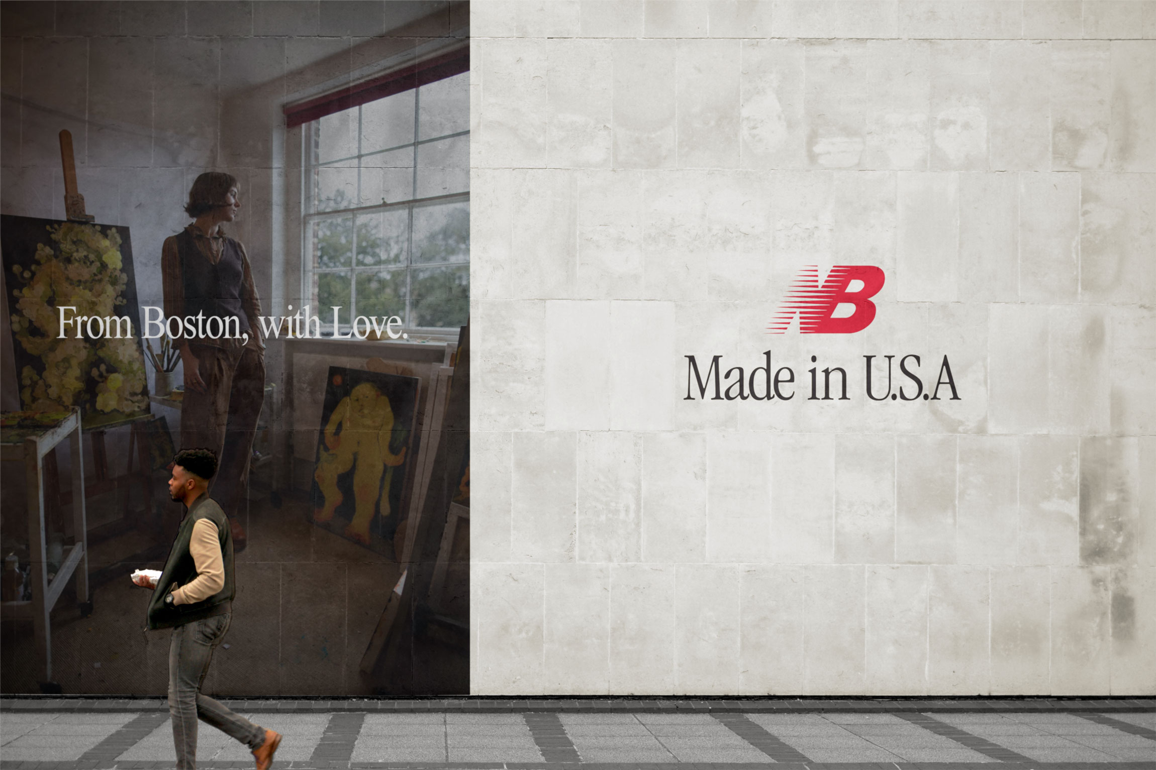
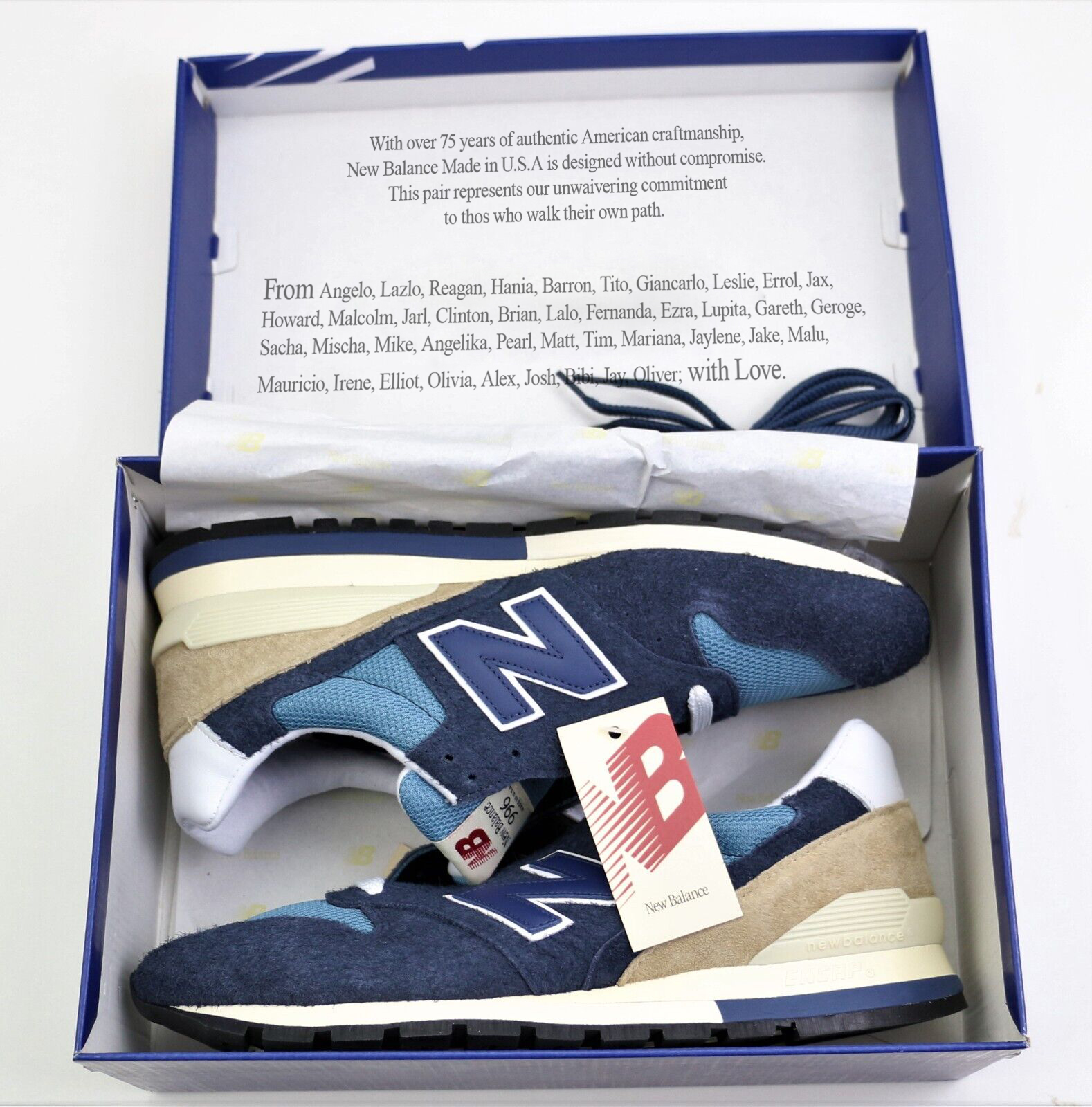

From U.S.A., With Love | Campaign Direction Proposal for New Balance MADE in U.S.A via Free Associates
(Campaign, Art Direction, Concept)
(Campaign, Art Direction, Concept)
New Balance’s MADE in U.S.A. line embodies timelesness and confident authenticity simultaneously by fearlessly innovating the classic silhouettes that make up the brand’s heritage with an emphasis on local material sourcing and craftspeopleship that ensure only the highest attention to detail and quality.
‘From U.S.A., with Love’ aims to refresh and further push the line’s elevated position, by championing NB Made’s local suppliers and craftspeople in order to re-define what it means to be made in the U.S.A.
The campaign dives deeper into the personal stories of what makes and have made the MADE in U.S.A. line possible (Places of work, suppliers, craftspeople, notable wearers, and other facilitators), the dedication and care that goes into their trade or craft, in order to elevate the line to new heights by highlighting an element that is essential to each and every pair of Made in U.S.A. NB’s: Love.

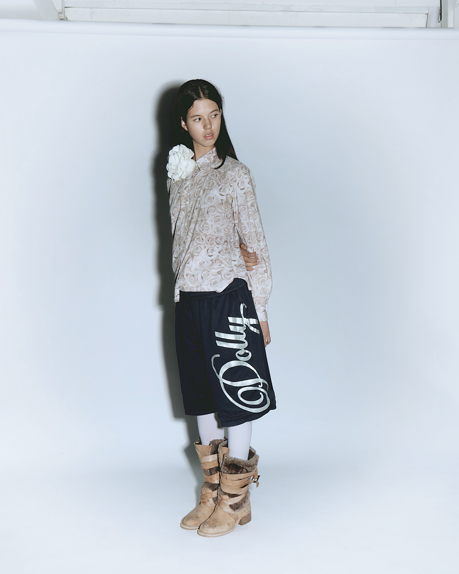
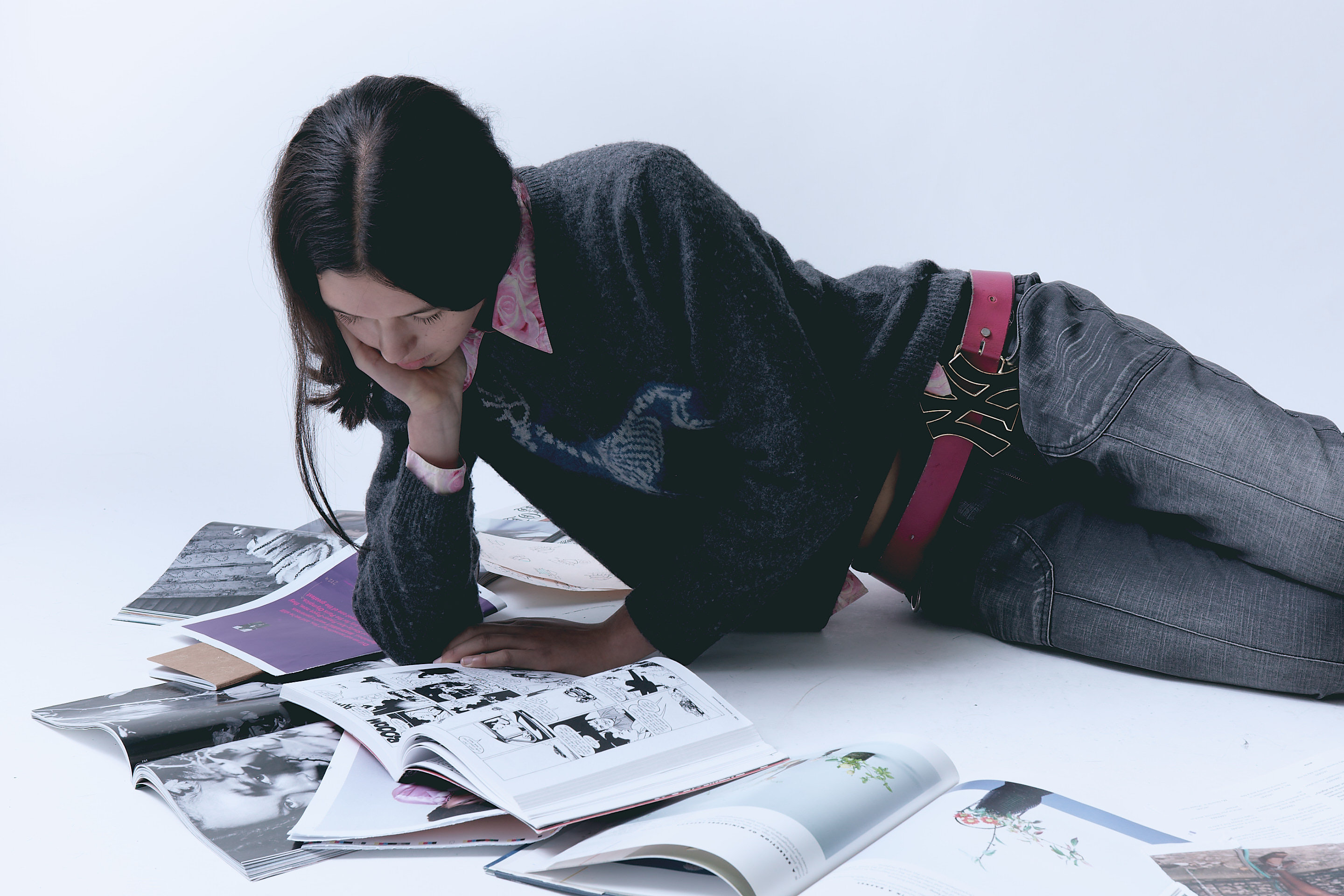

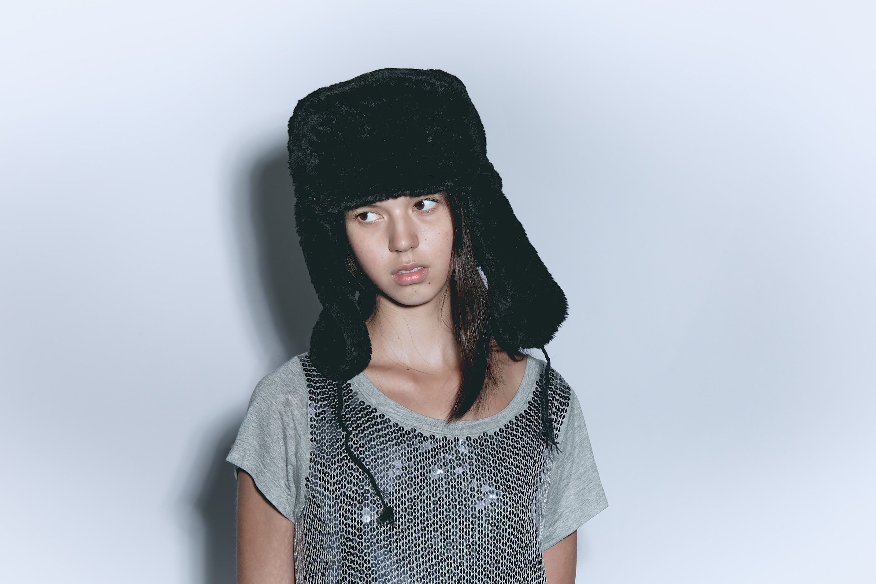
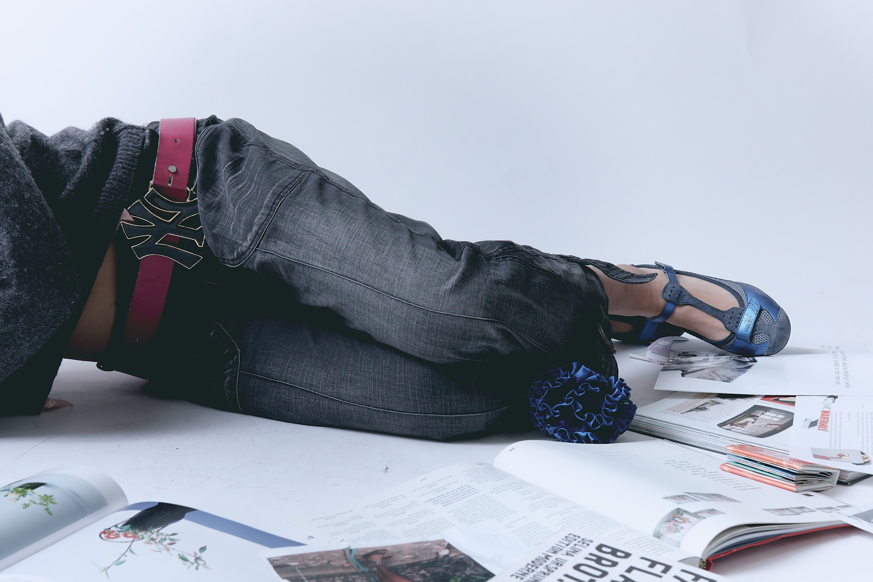
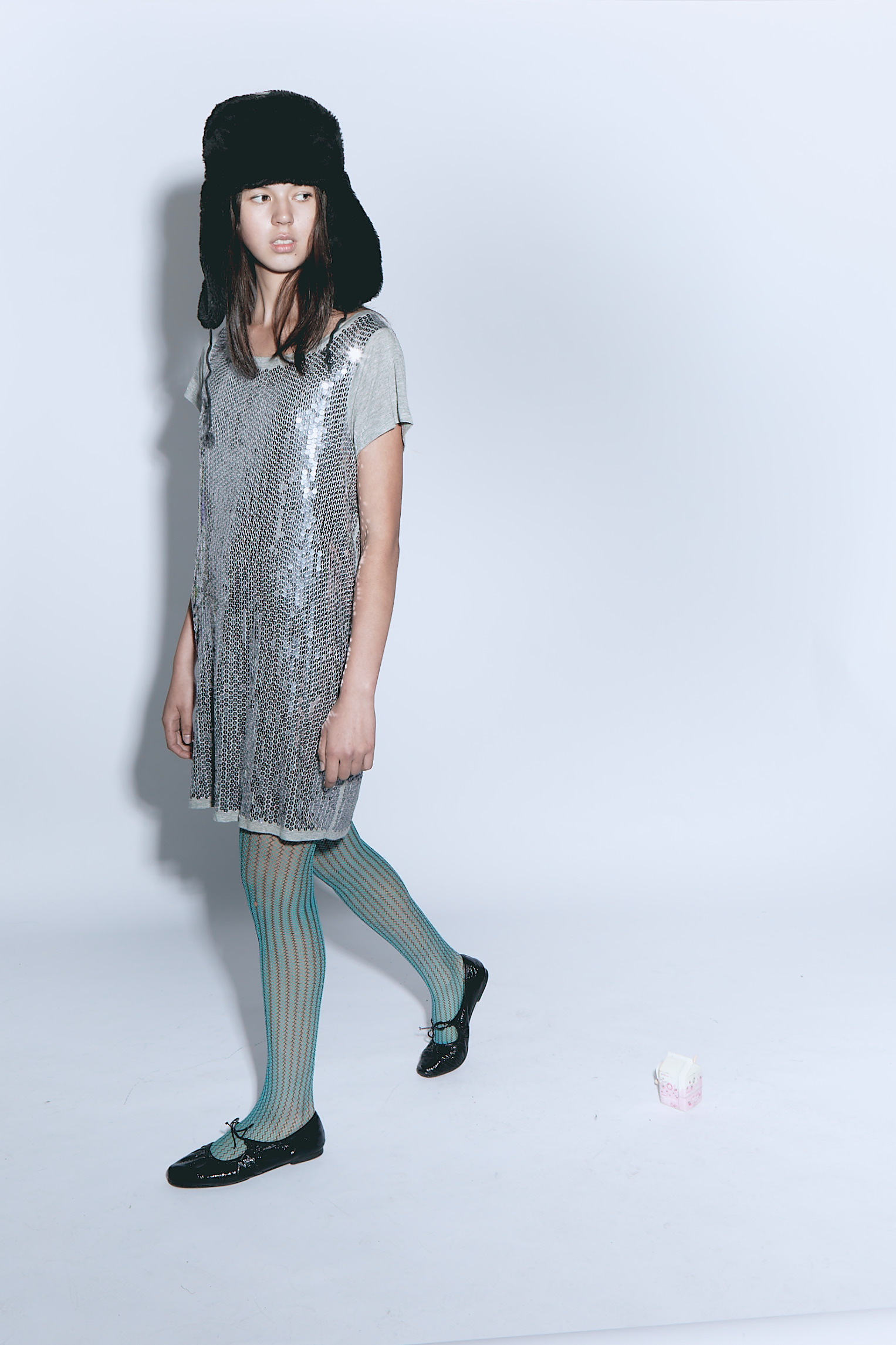
Backpedal (Layla)
(Art Direction, Lighting, Digital Operation)
Inspired by Olivia Gatwood’s poem of the same name, Backpedal deals with the beauty and chaos of youth, the clash between one’s growing pains of maturity and the bilss of naïvity.
(Art Direction, Lighting, Digital Operation)
Inspired by Olivia Gatwood’s poem of the same name, Backpedal deals with the beauty and chaos of youth, the clash between one’s growing pains of maturity and the bilss of naïvity.
Andrés Nava H. Art Direction/Lighting/Digital Operation
Amy Threader Photography/Props
Tally Francis Styling
Amy Threader Photography/Props
Tally Francis Styling

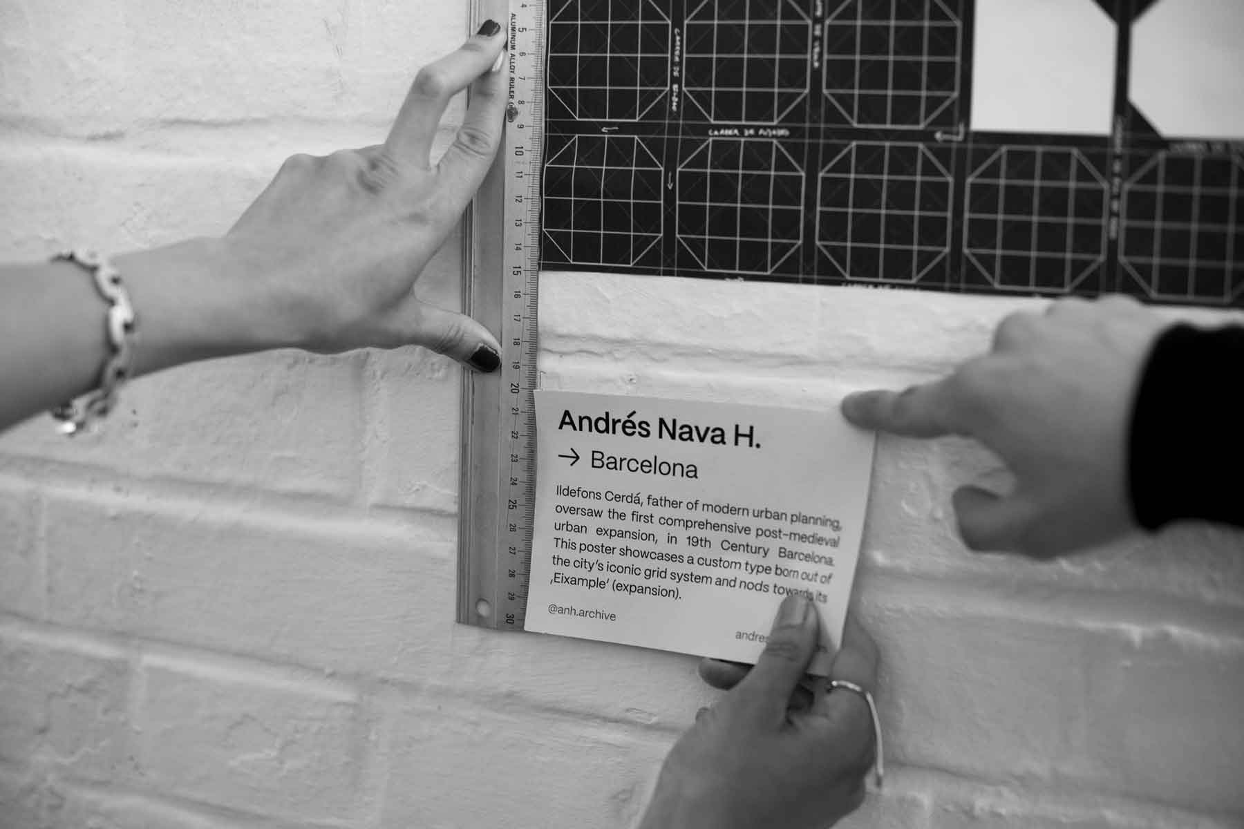
barcelona | ShowUsYourType International Award Recipient
(Graphics, Print, Typography)
(Graphics, Print, Typography)
Central to the historical and geographical essence of the city of Barcelona is yet another piece of design: Ildefons Cerdà’s ‘Eixample’ (Catalan for 'extension')—a landmark project for modern urban planning that continues to impact the city’s inhabitants through the city’s iconic grid system and octagonal blocks.
Parting from Cerdà’s project, the poster considers the movement and continous evolution of urban spaces by imagining one of Cerdà’s cyanotype blueprints-in-progress on the way to working out the final details of his radical ideas for the future of the city.


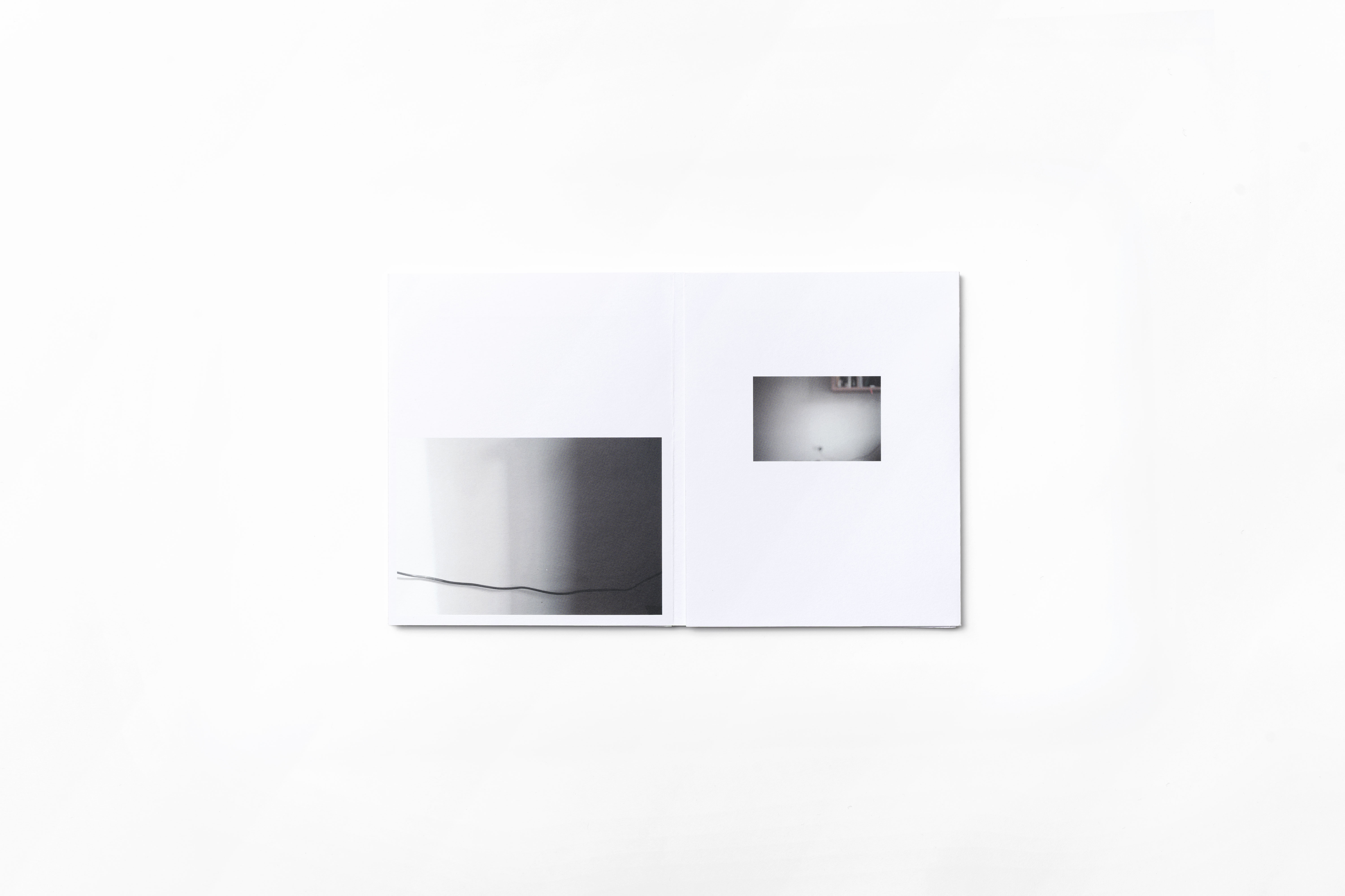

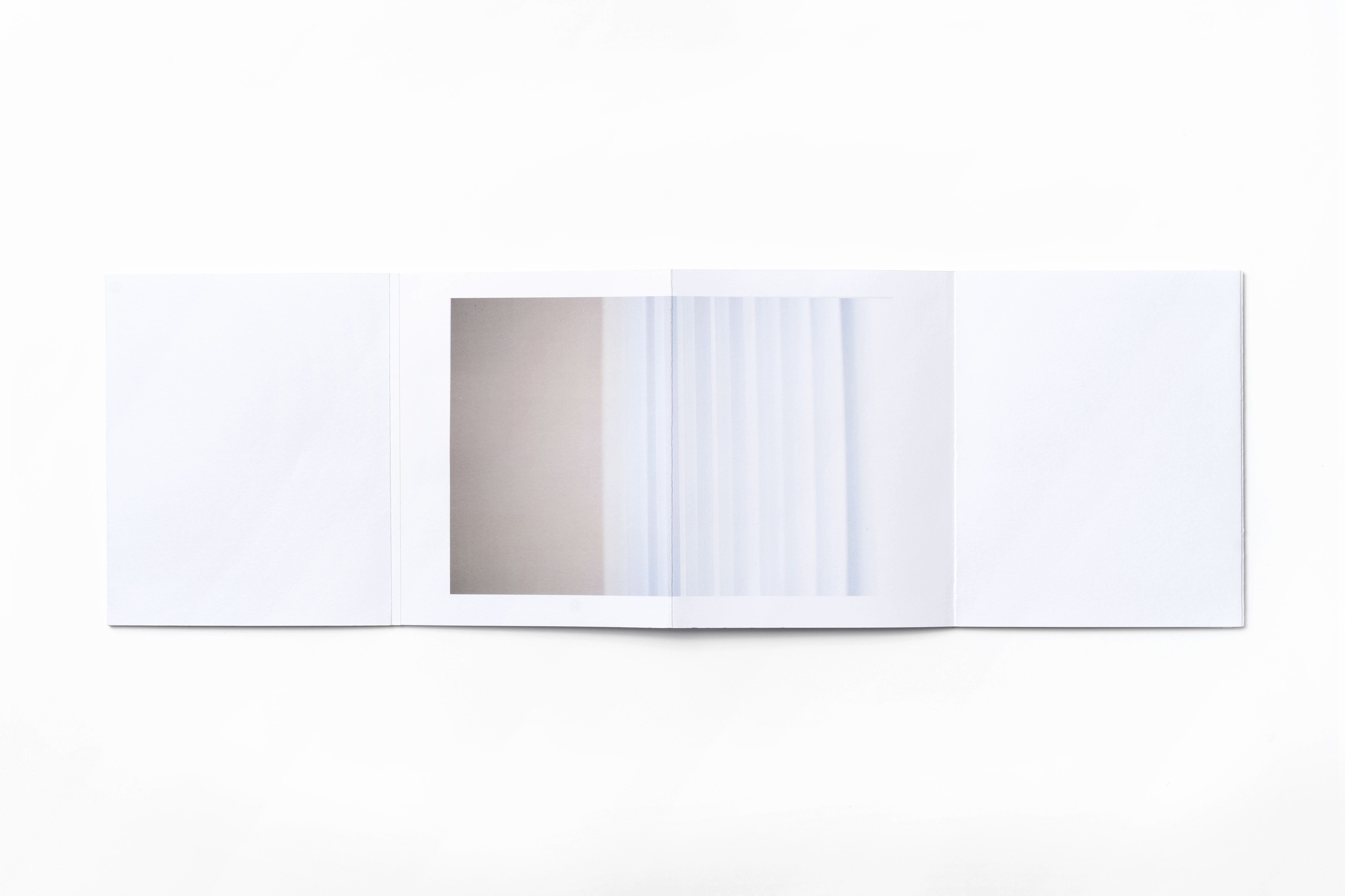
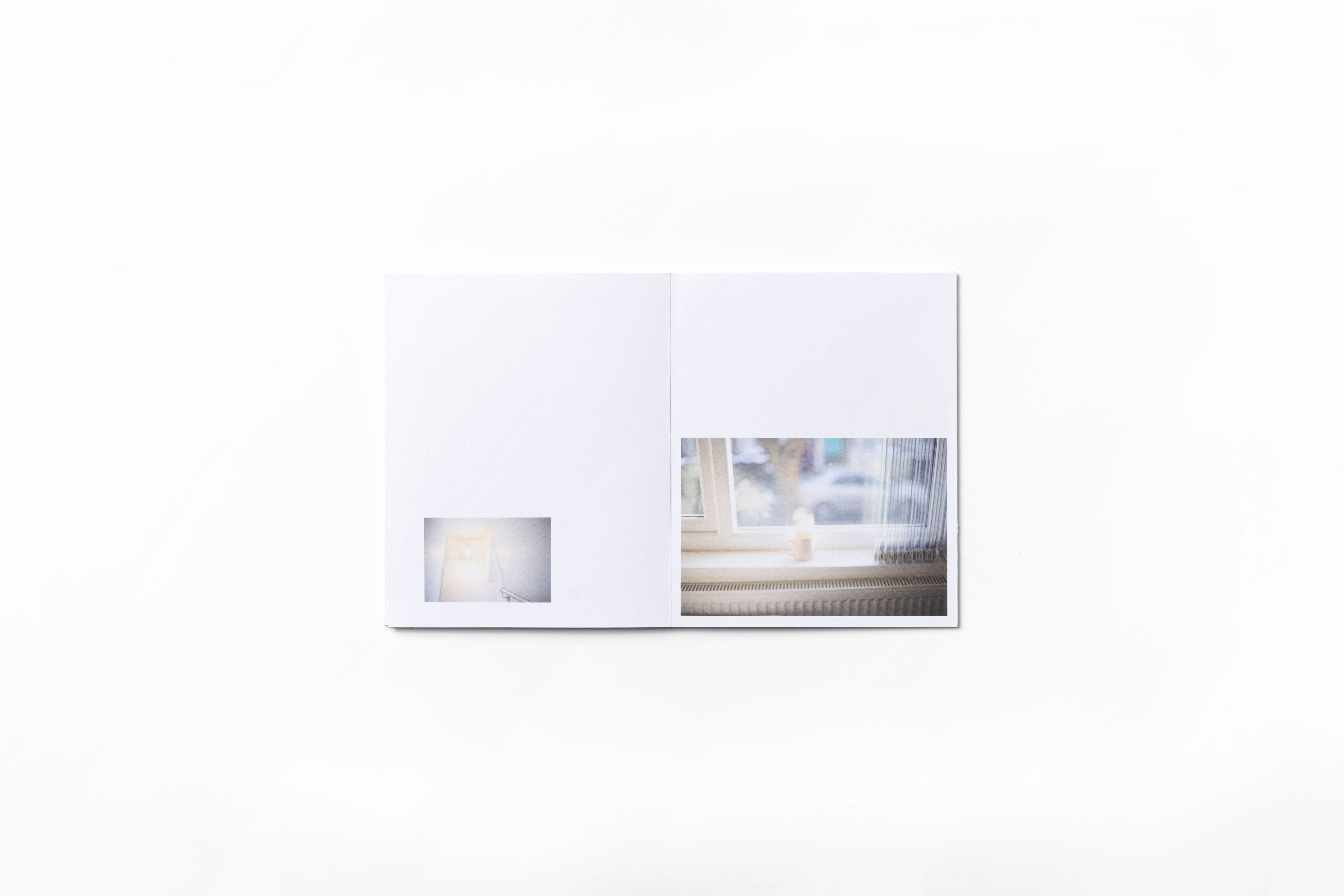
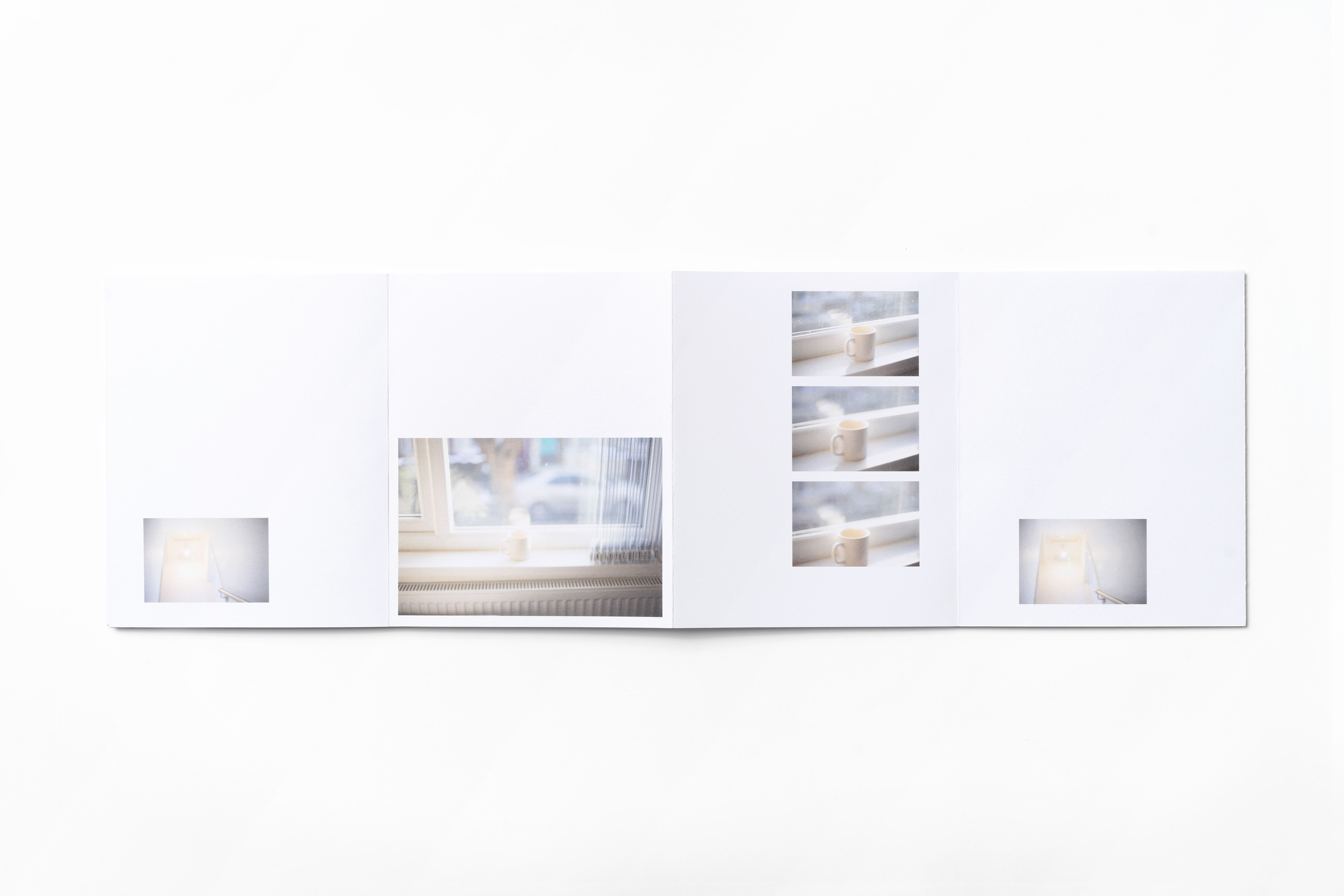

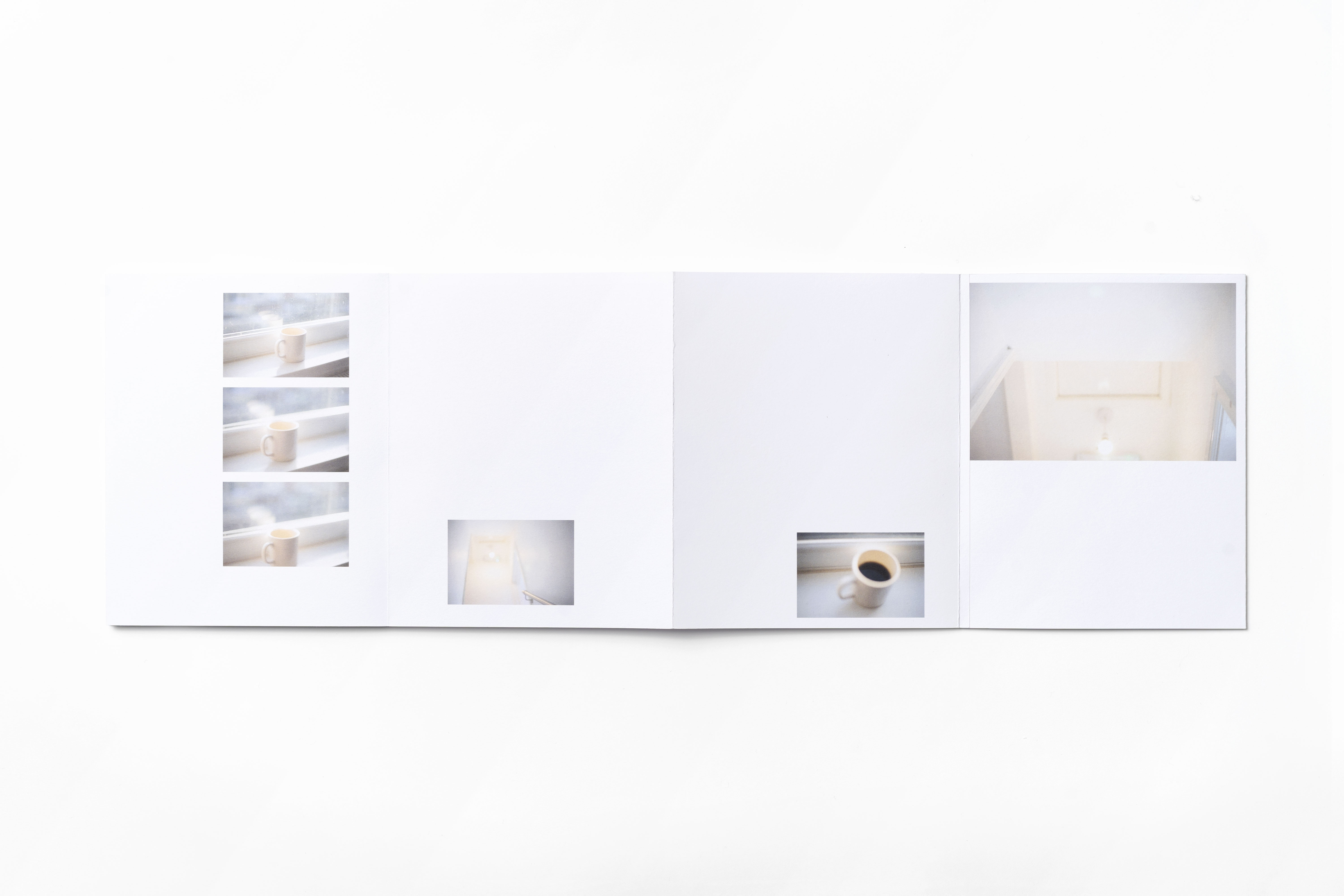


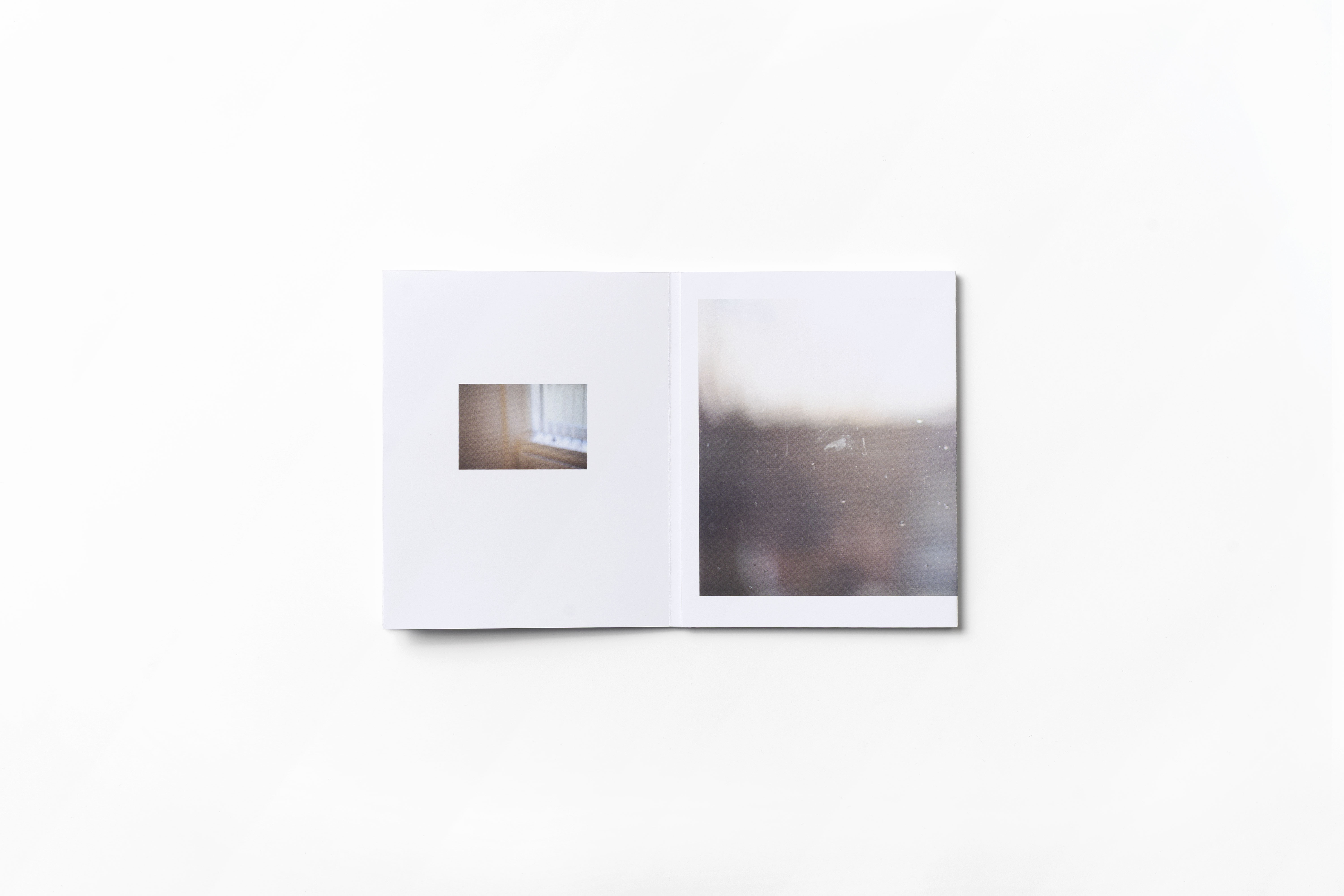


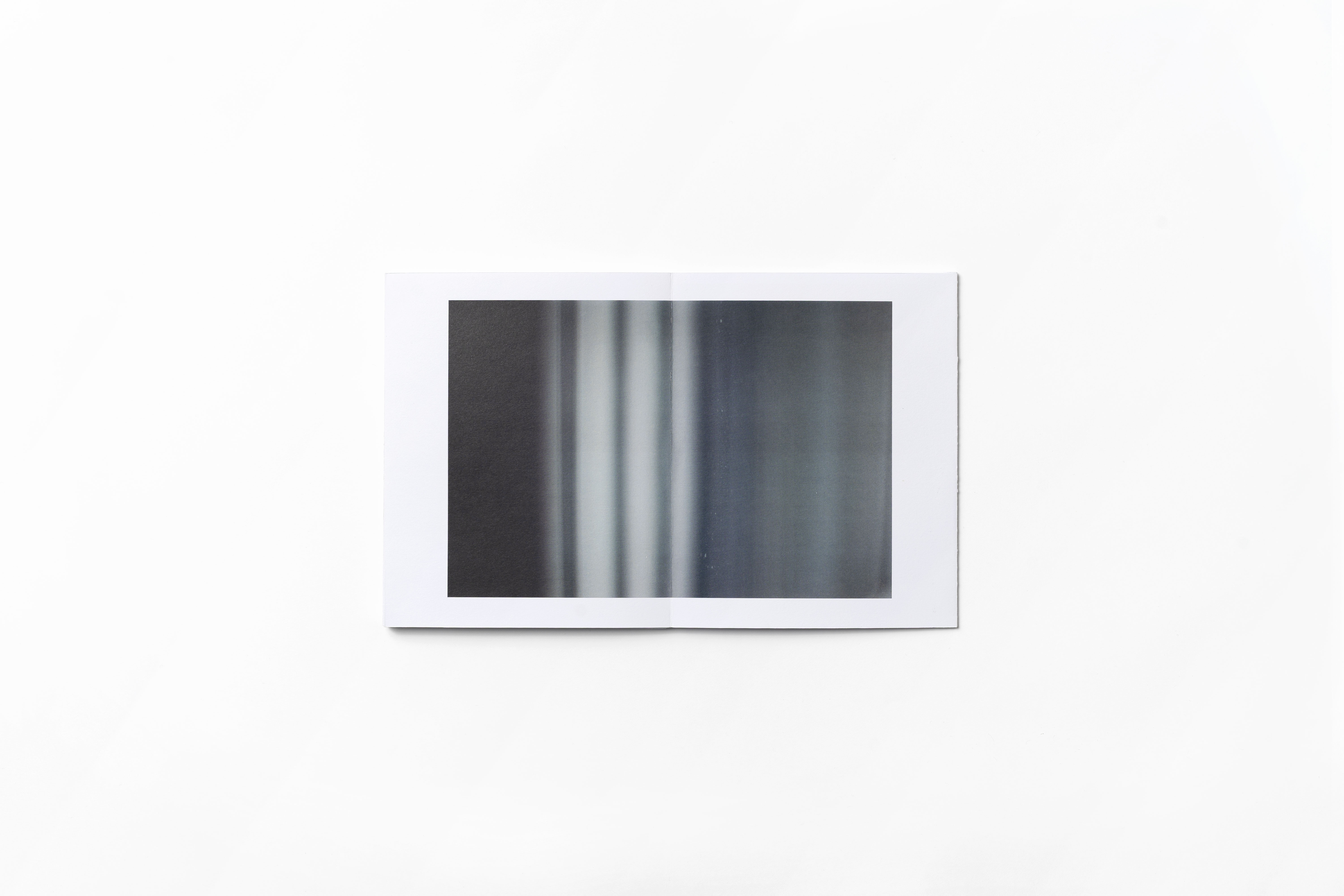
here, now...
(Photography, Layout Design, Concept, Creative Direction, Bookbinding)
(Photography, Layout Design, Concept, Creative Direction, Bookbinding)
Approachable form either end, a neverending sense of ‘nowness’ made up of instinctive gazes attempts to transform the austere visual results of monotonous domestic structure into something abstract enough to be registered as familiar, but still untraceable.

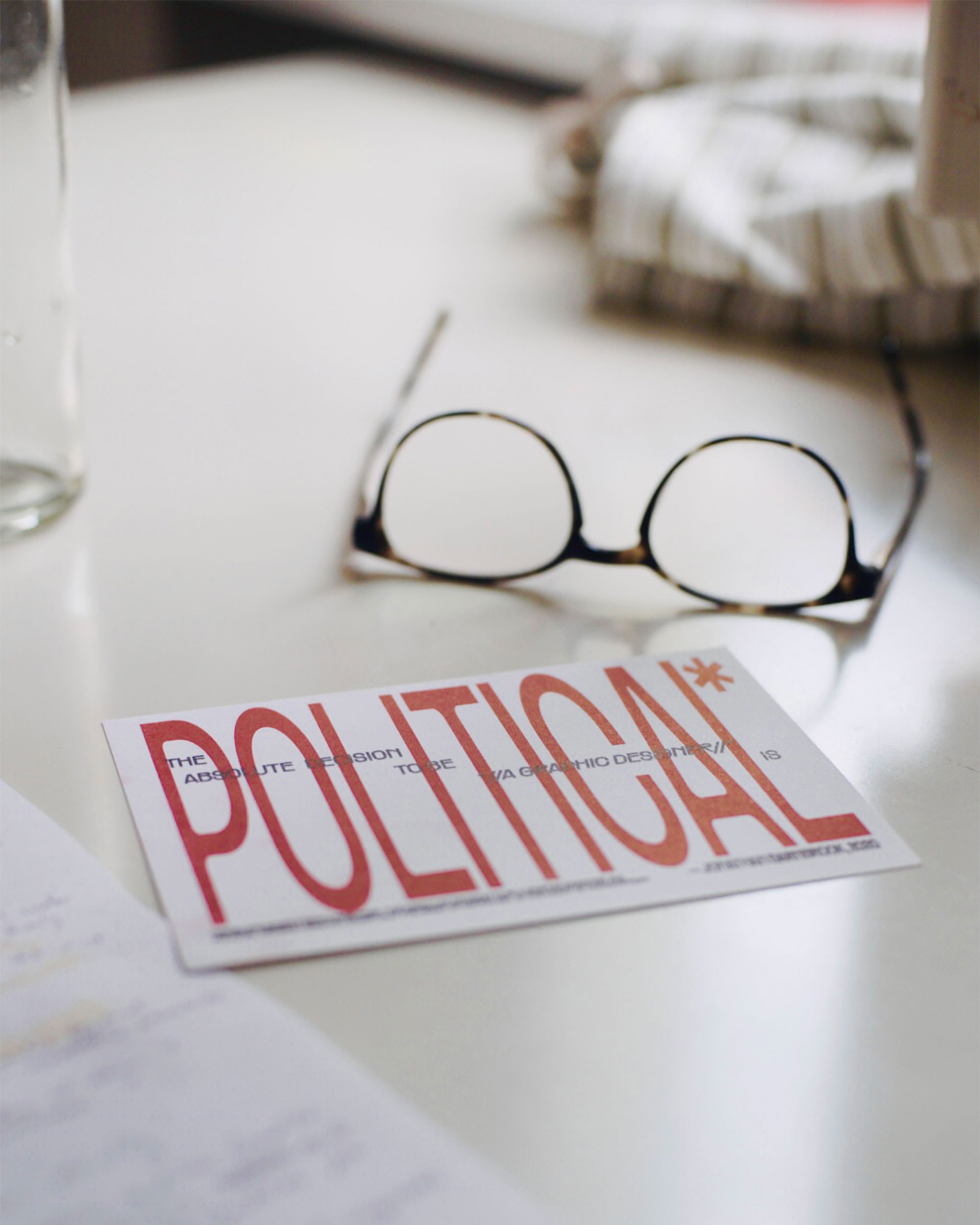
POLITICAL
(Graphics, Print, Typography)
(Graphics, Print, Typography)
In a 2020 interview with It’s Nice That, Jonathan Barnbrook reminds us the designer’s destructive role in mas-consumption and information pollution. Taking a direct—but contextually ambiguous—quote from said interview, these stickers and postcards send a message of accountability and responsability for the designer delivered through an internet-era play on the aesthetics of warning signs and danger labels.
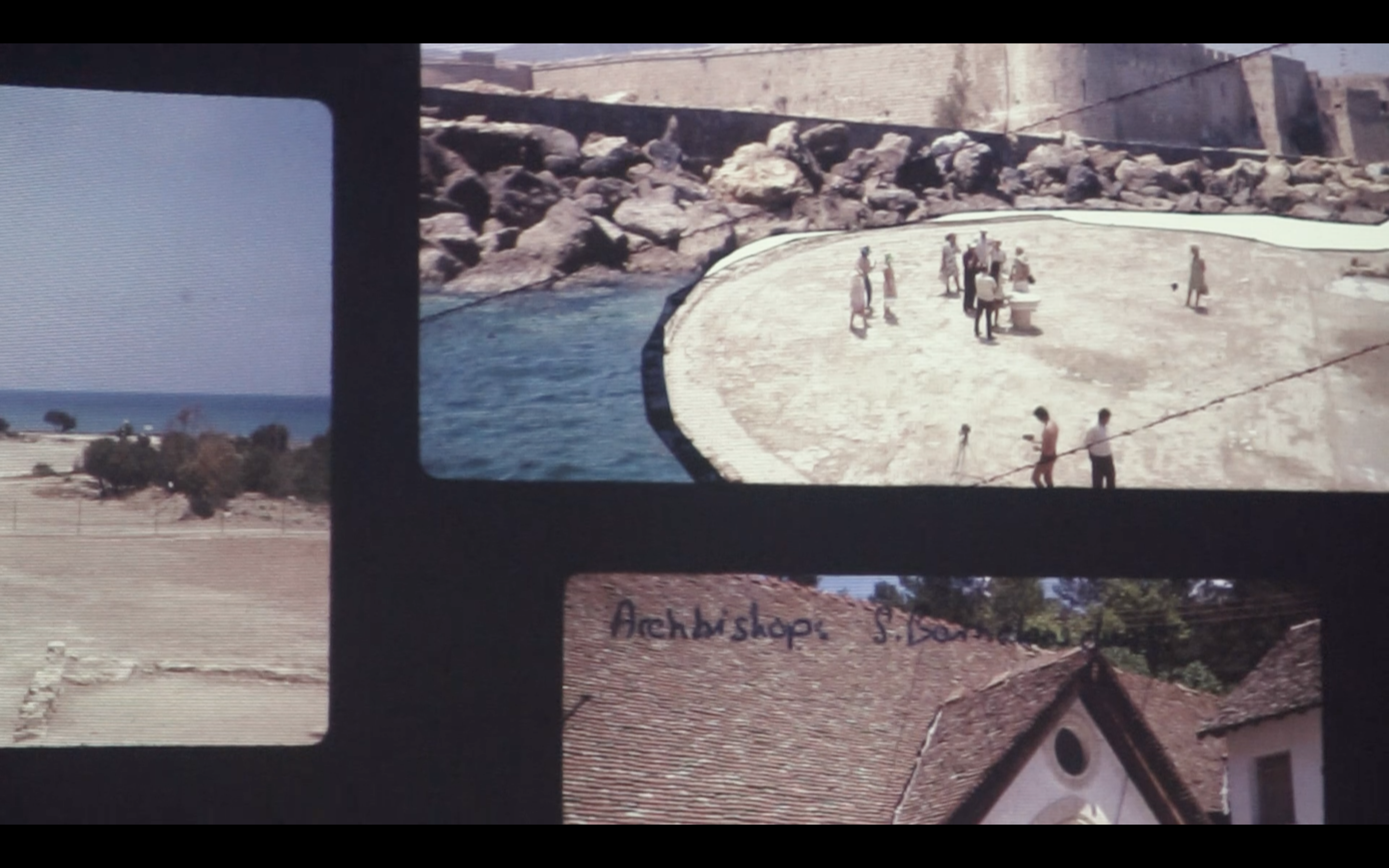
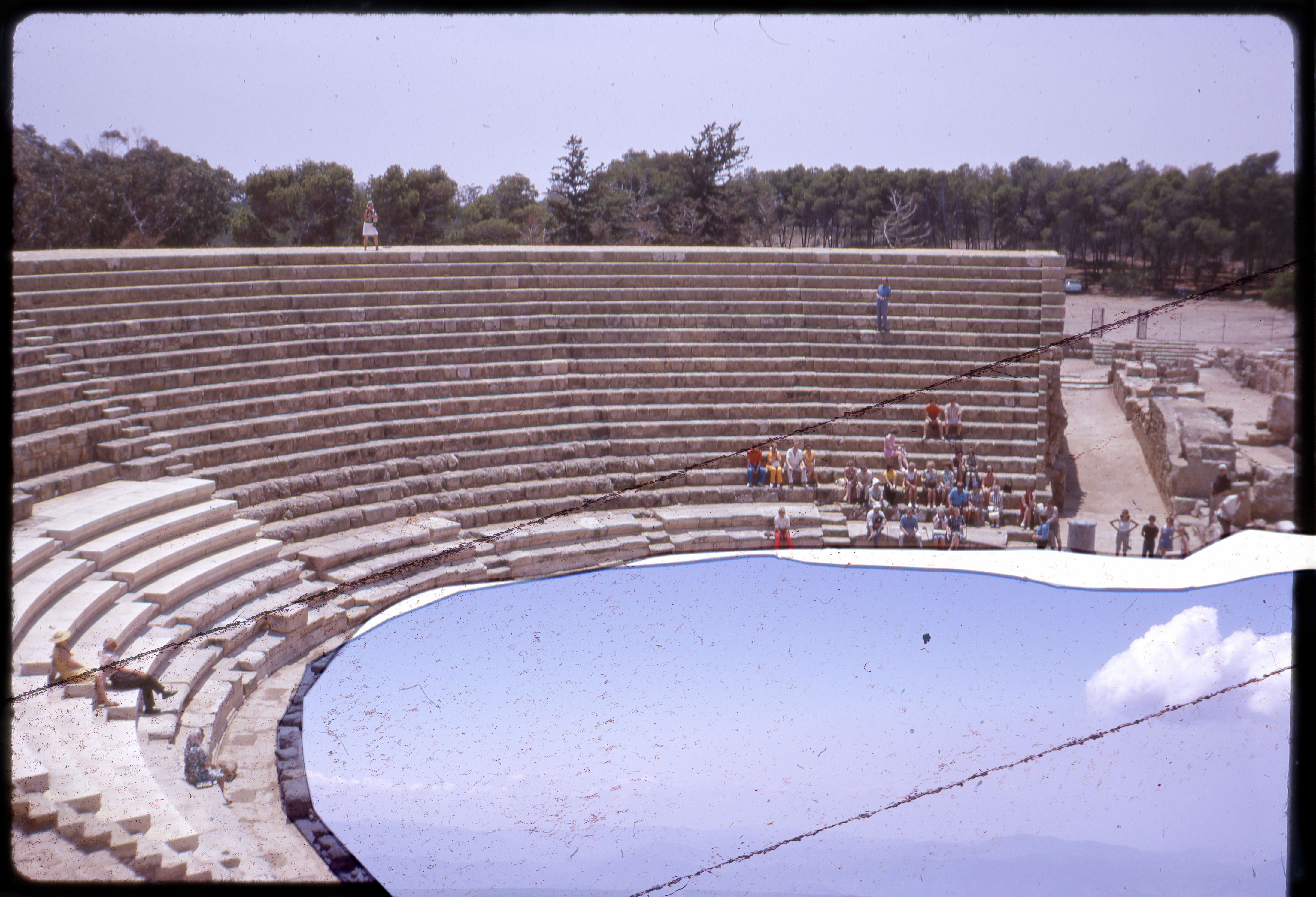

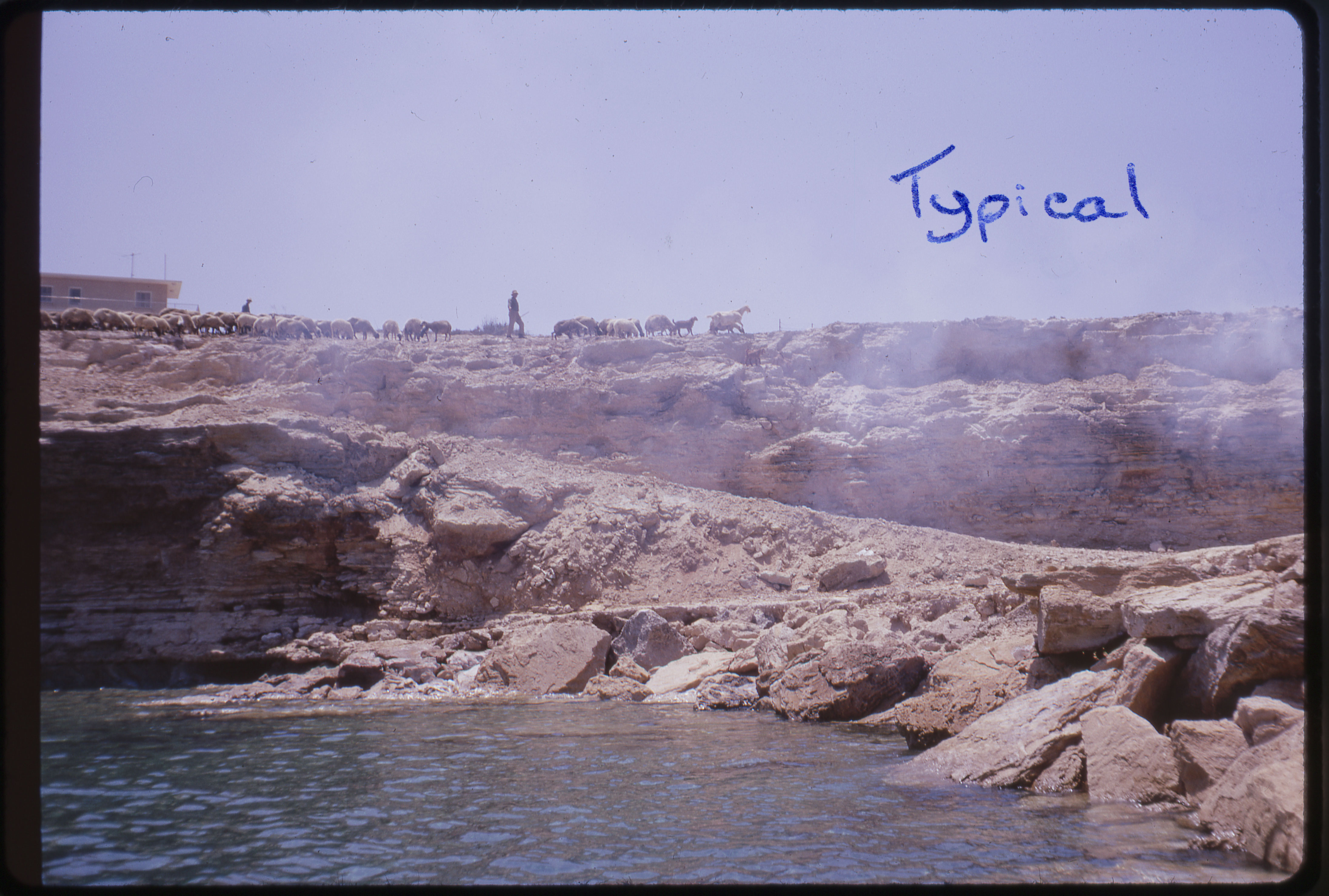


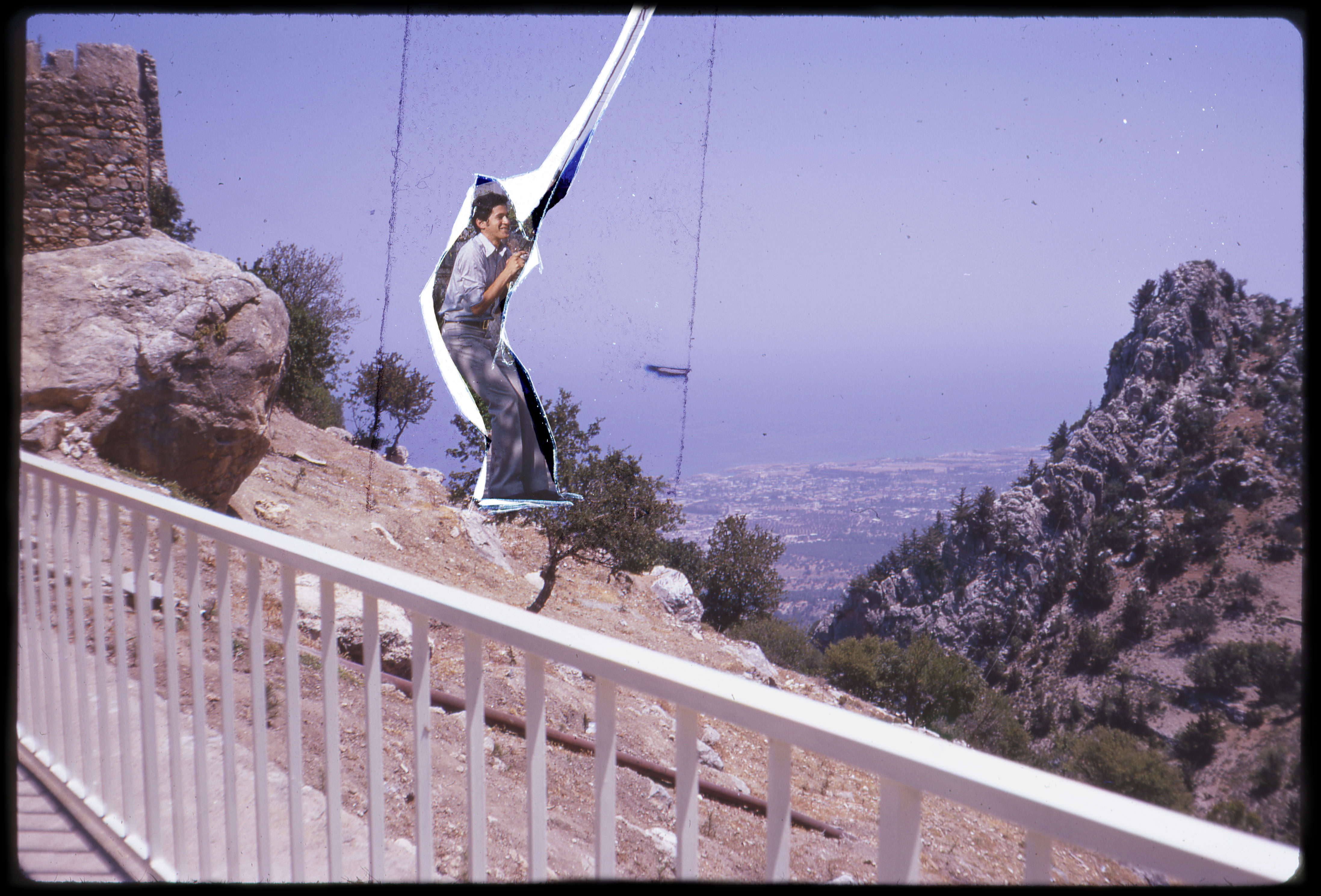
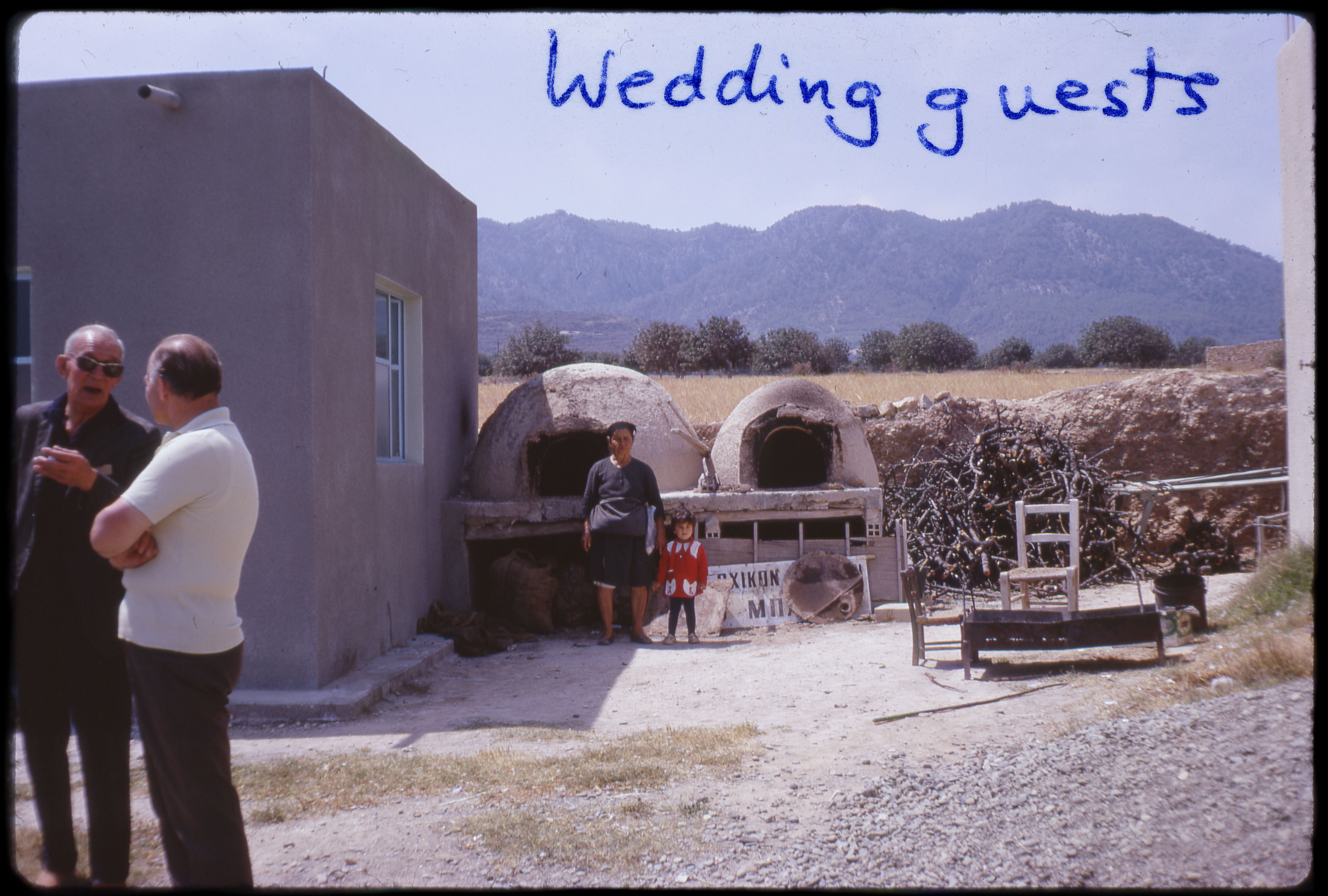
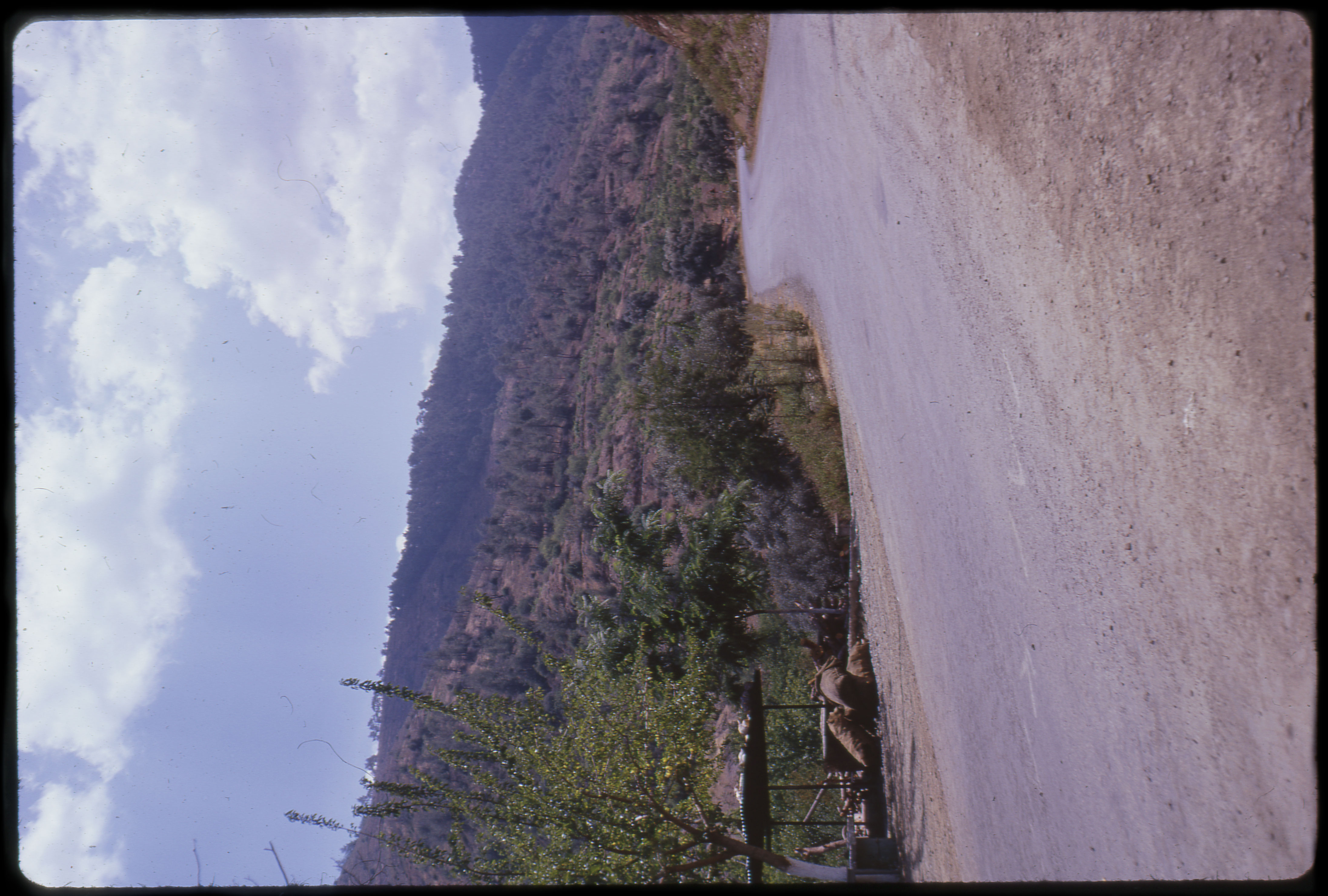
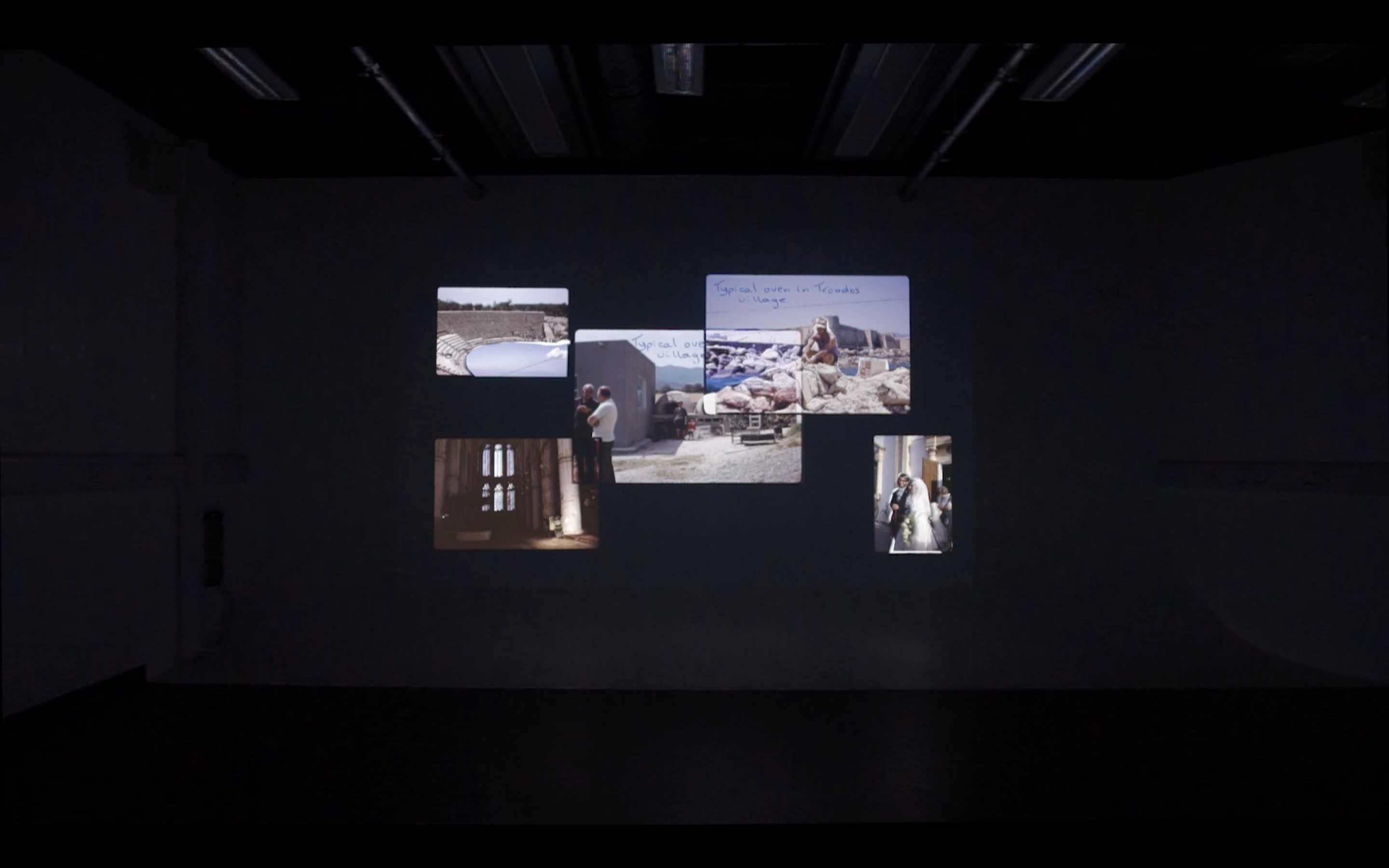
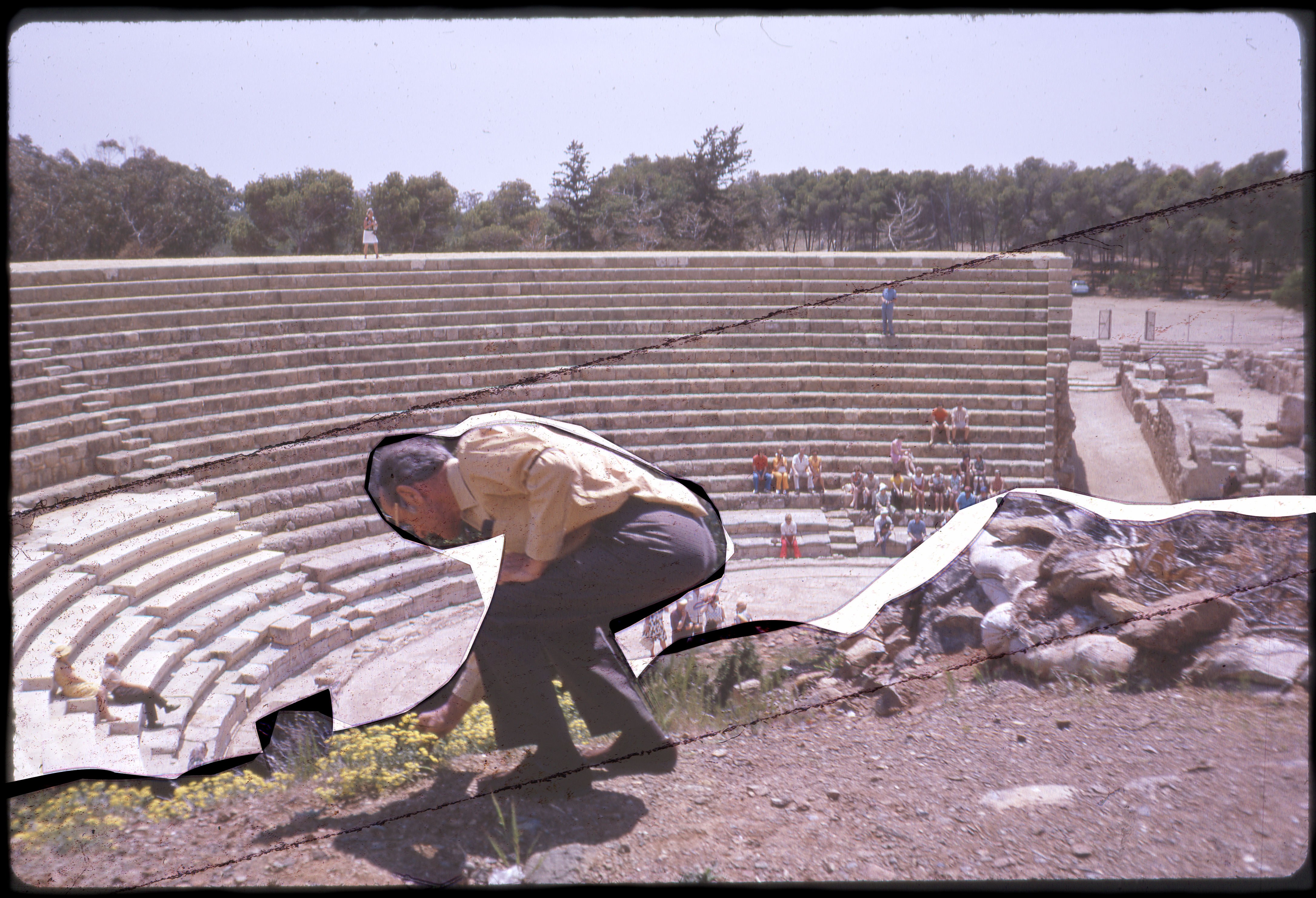

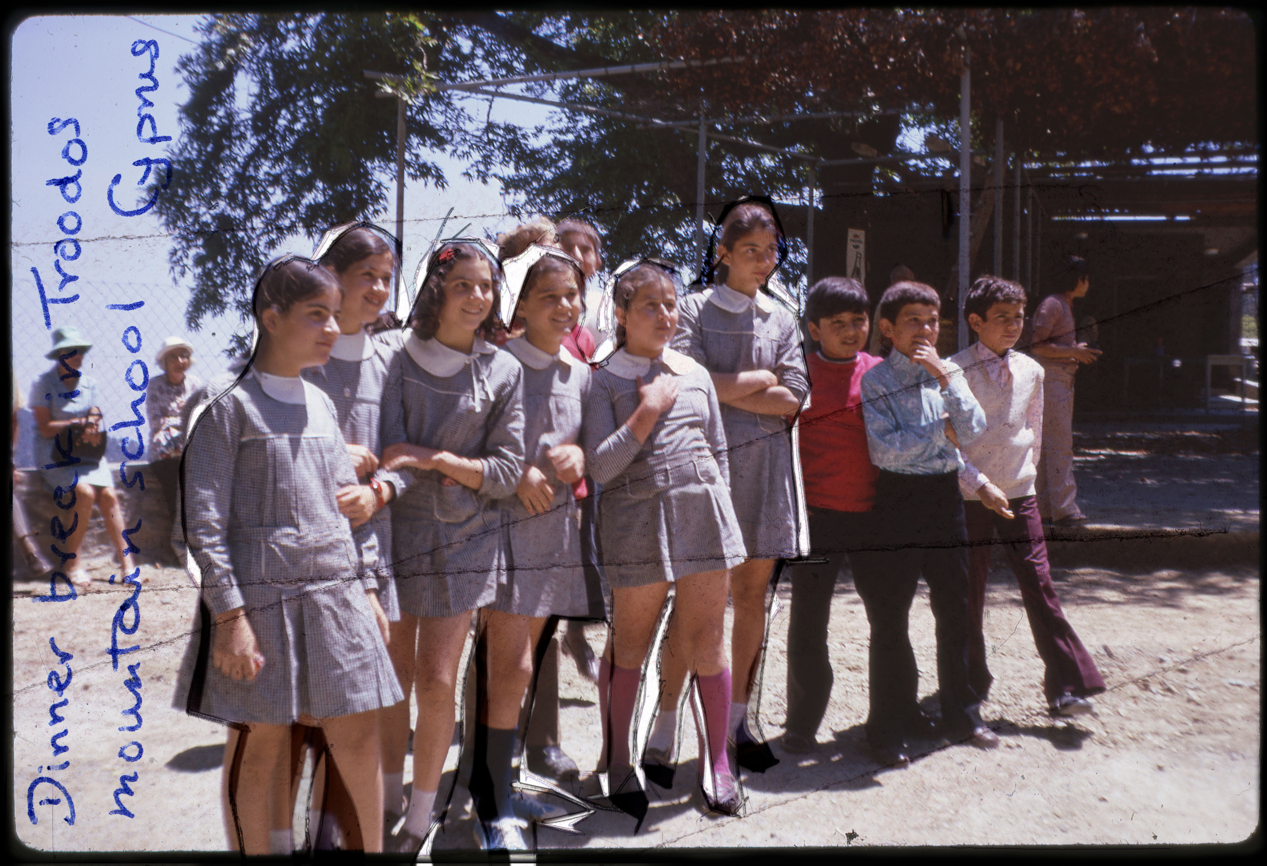


Kodachromes: June '73
(Concept, Video, Installation)
(Concept, Video, Installation)
Kodachromes: June ‘73 presents a variety of parallel photographic realities constructed out of found imagery from an anonymous family archive made up of 35mm Kodachrome transparency slides dated June 1973.
Direct, overt intervention in the form of mixed-media collage constructs new, pending moments out of what otherwise would remain static photographic ‘truths’, and thereby sheds light on the inherent construction that takes place within both the act of photographing and that of interpreting photographs.
As visual and lexical elements are repeated and reworked into different contexts, an inability to distinguish the constructed from the untouched invites viewers to continuously adapt their interpretations of the images as each burst of light and sound fight for the viewer’s gaze in a rhythmic audio-visual experience.


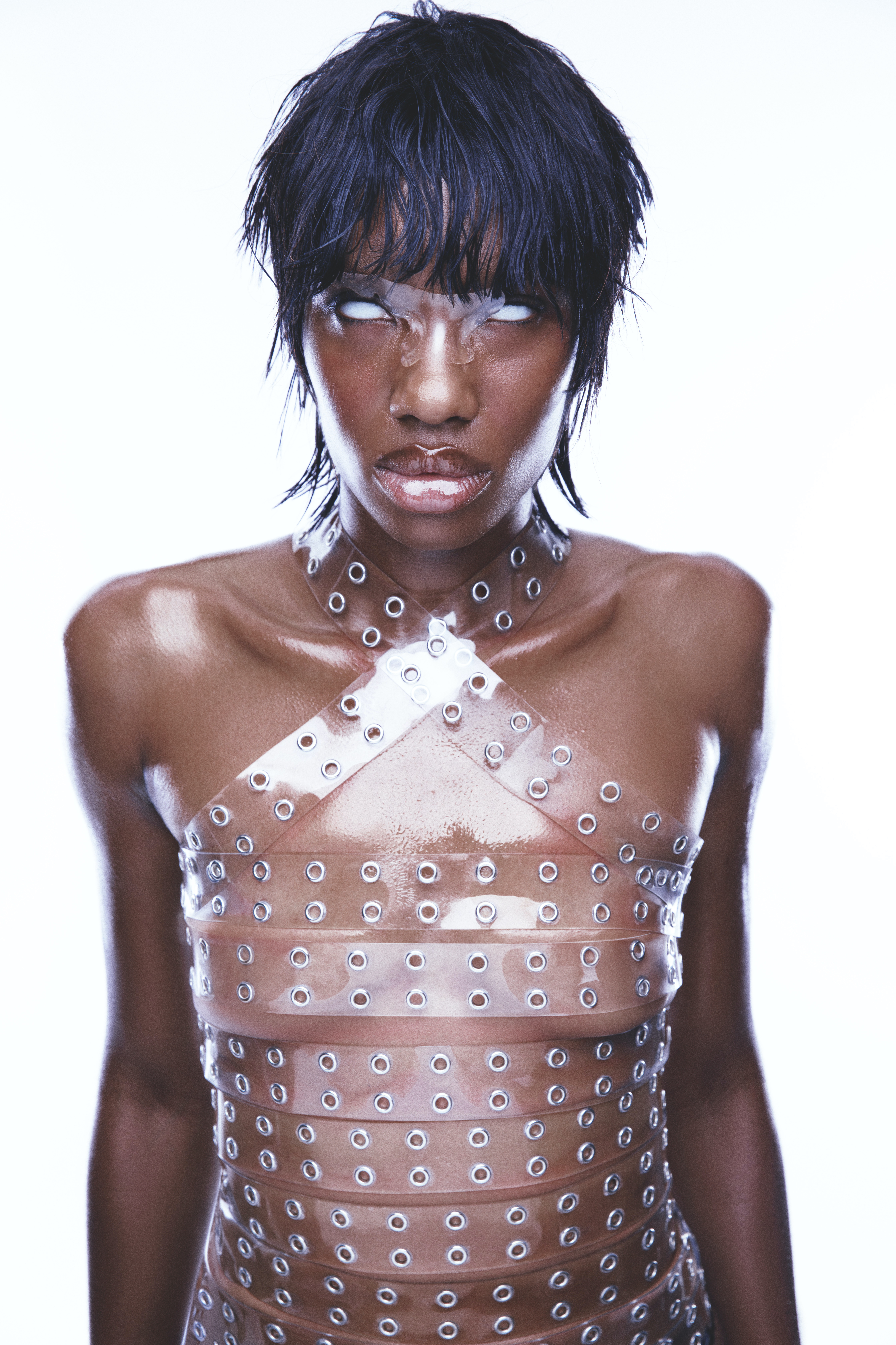
PLASTIC | REVS PRINT ISSUE #24: THE CONNECTION
(Lighting, Photography Assistance)
A satirical approach on the current state of the corporate agenda.
(Lighting, Photography Assistance)
A satirical approach on the current state of the corporate agenda.
Jadzia Scott Creative Direction, Styling, Casting
Bryan Torres Photography
Andrés Nava H. Lighting Tech, Photography Assistance
Alex José. Lighting Tech, Photography Assistance
Isabella Amora Digital Operation
Po Lin Set Design & Dressing
Seamus Bryne Set Design Assistance
Yasmin Ntege Styling Assistance
Alexandra Geisari Talent
Wen Hsieh Styling
Takumi Horiwaki Hair
Sacha Chudeeva Make-up
Katt Katan Nails
Mahlah Catline Production


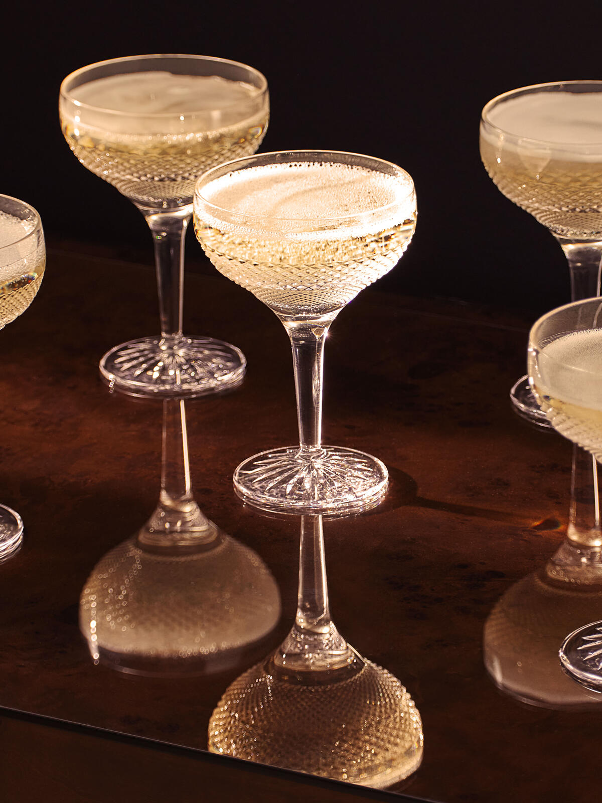

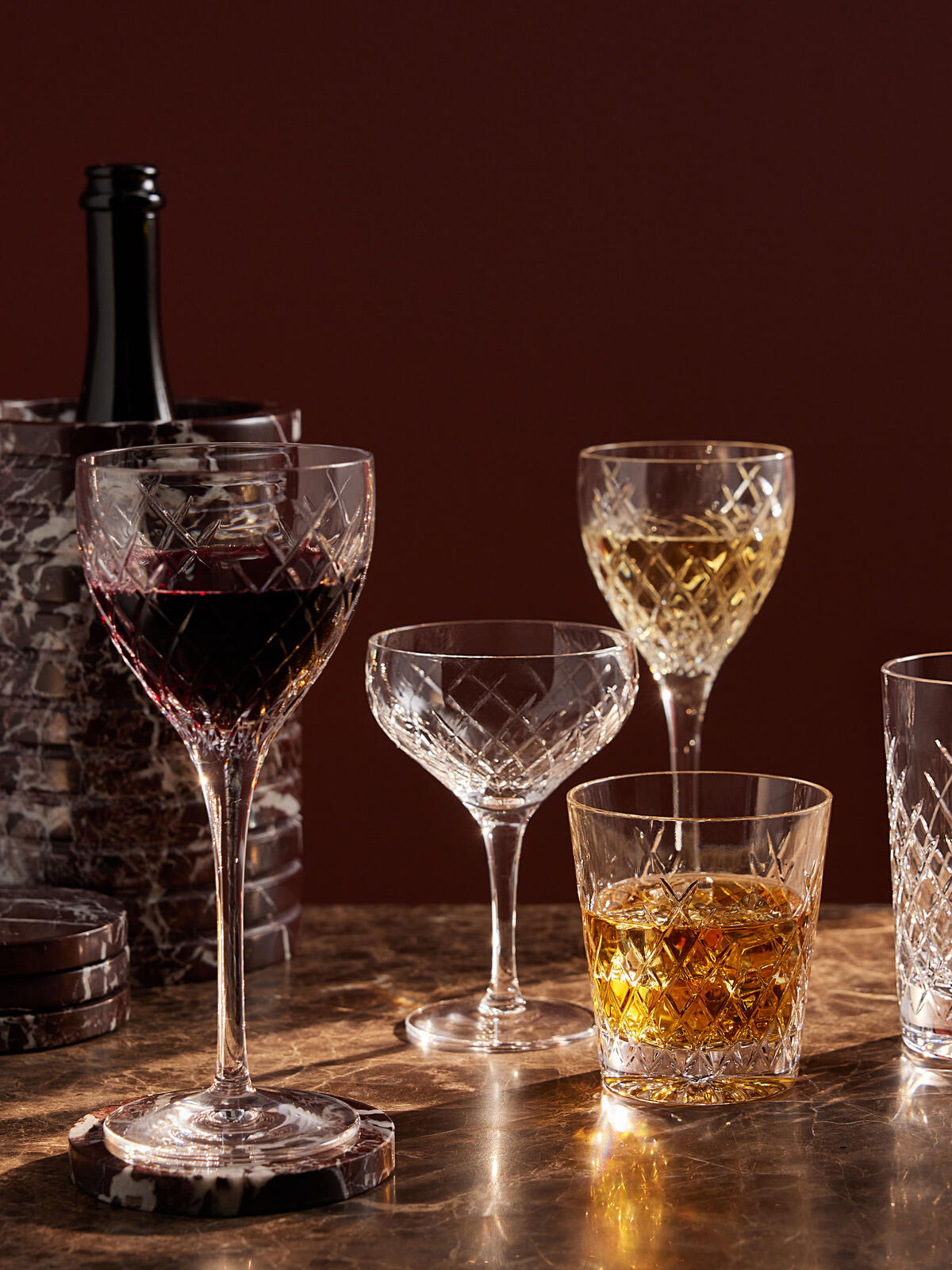
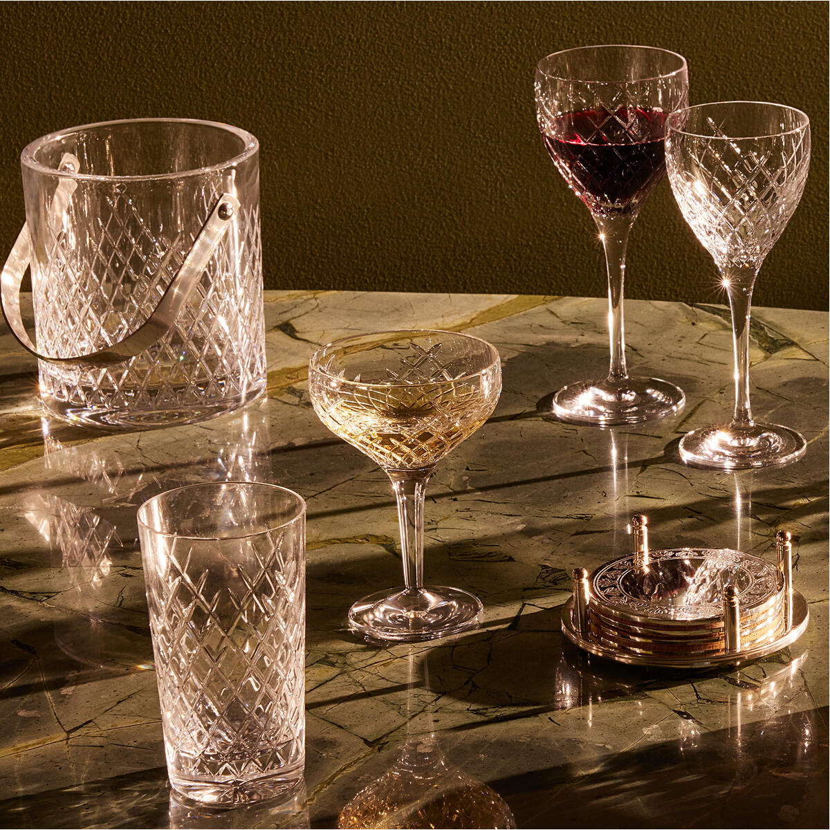

Soho House—Soho Home Crystal Collection Campaign
(Photography Assistance, Lighting, Digital Operation, Styling)
From Barwell to Roebling and Huxley, Soho House’s iconic crystal glassware ranges reflect the Houses they're used in, with a variety of designs, crisp cuts and a weighty feel making each collection one of a kind.
(Photography Assistance, Lighting, Digital Operation, Styling)
From Barwell to Roebling and Huxley, Soho House’s iconic crystal glassware ranges reflect the Houses they're used in, with a variety of designs, crisp cuts and a weighty feel making each collection one of a kind.
Hannah Perse-Cottle Art Direction/Styling
Ryan Handy Team Lead /Lighting/Video
Tavis Wright Photography/Video
Andrés Nava H. Lighting, Photography, Video
& Styling Assistance/Digital Operation
Hollie Oakwell-Boulton Retouching
Ryan Handy Team Lead /Lighting/Video
Tavis Wright Photography/Video
Andrés Nava H. Lighting, Photography, Video
& Styling Assistance/Digital Operation
Hollie Oakwell-Boulton Retouching
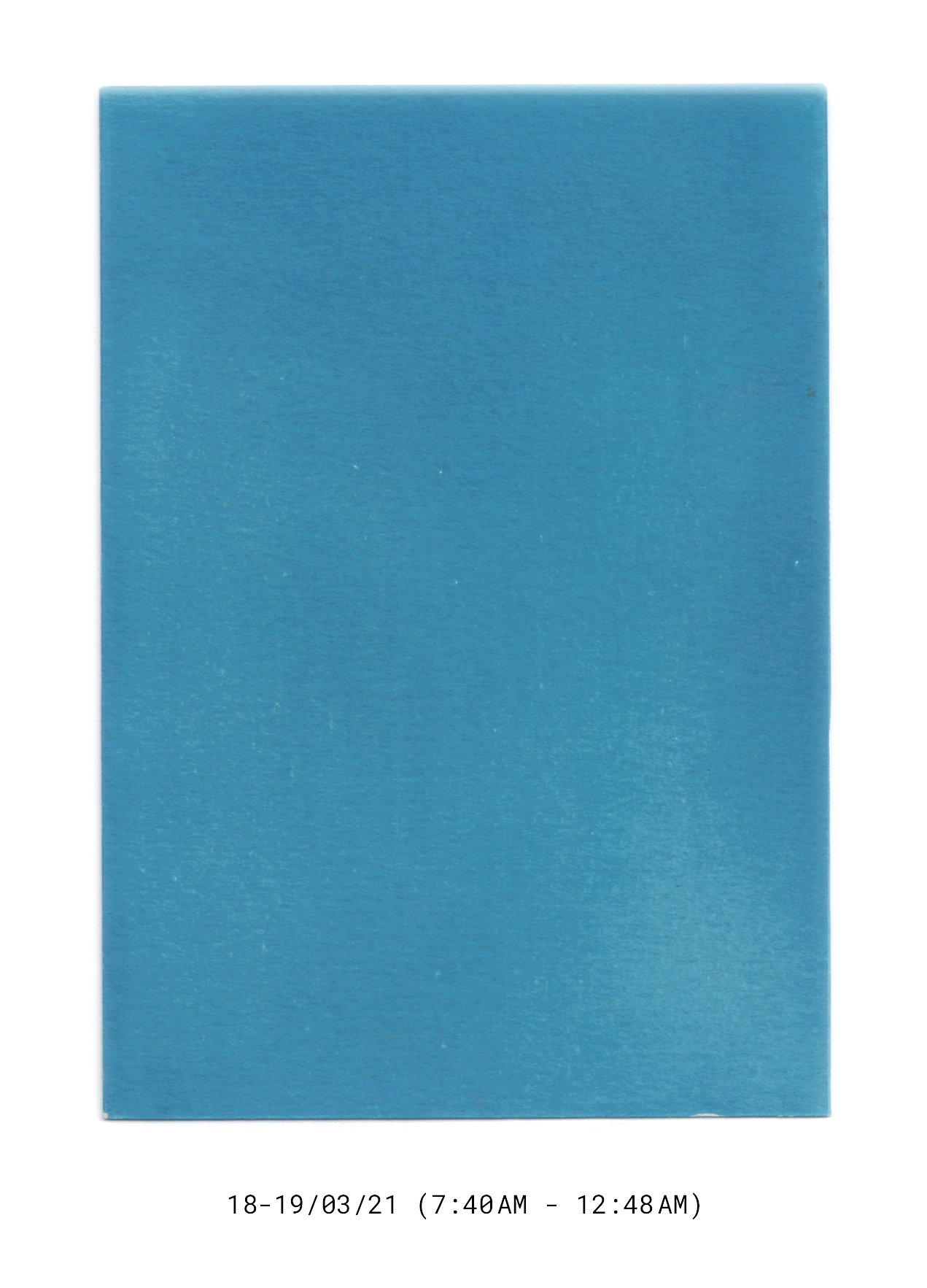
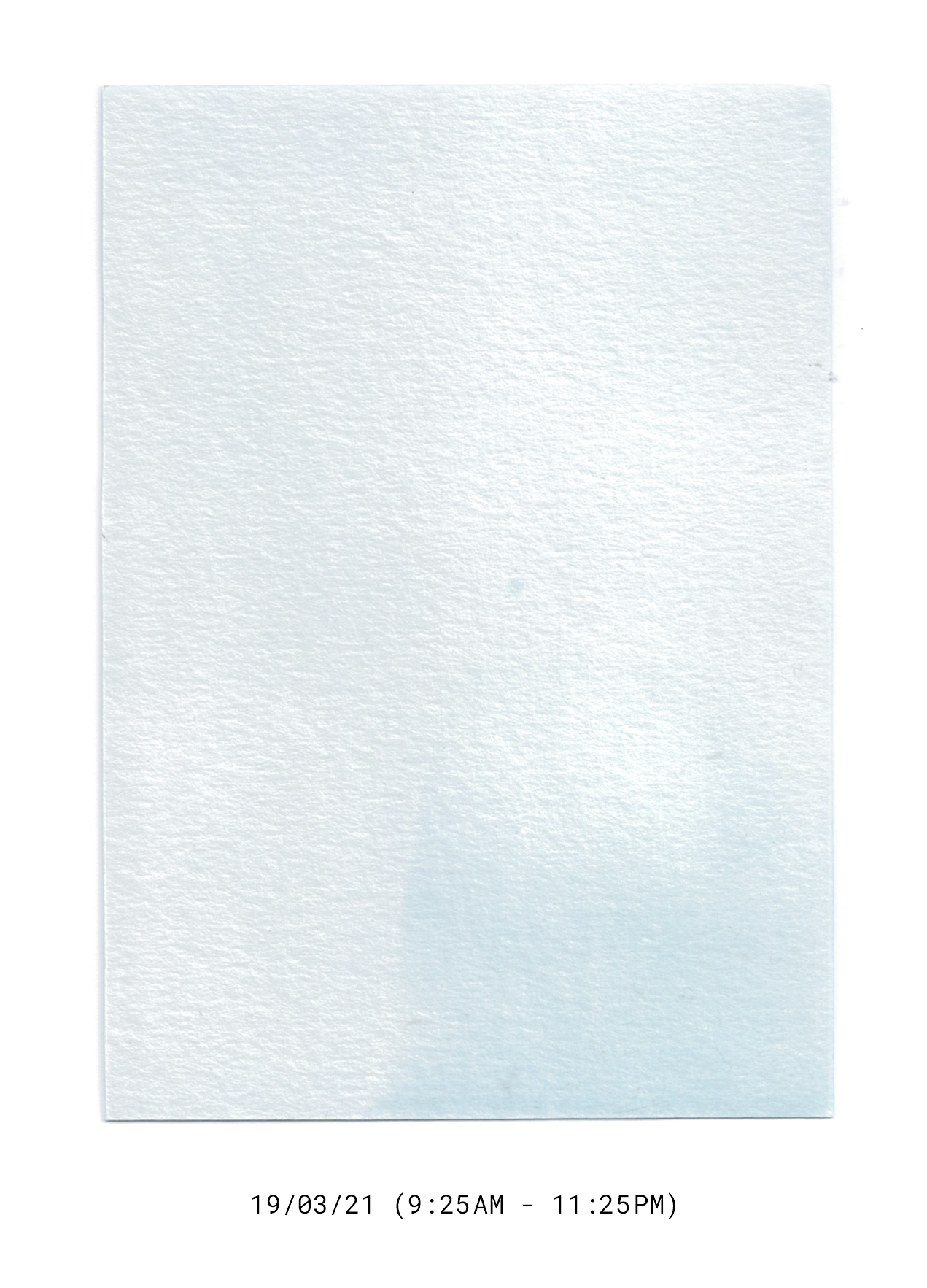
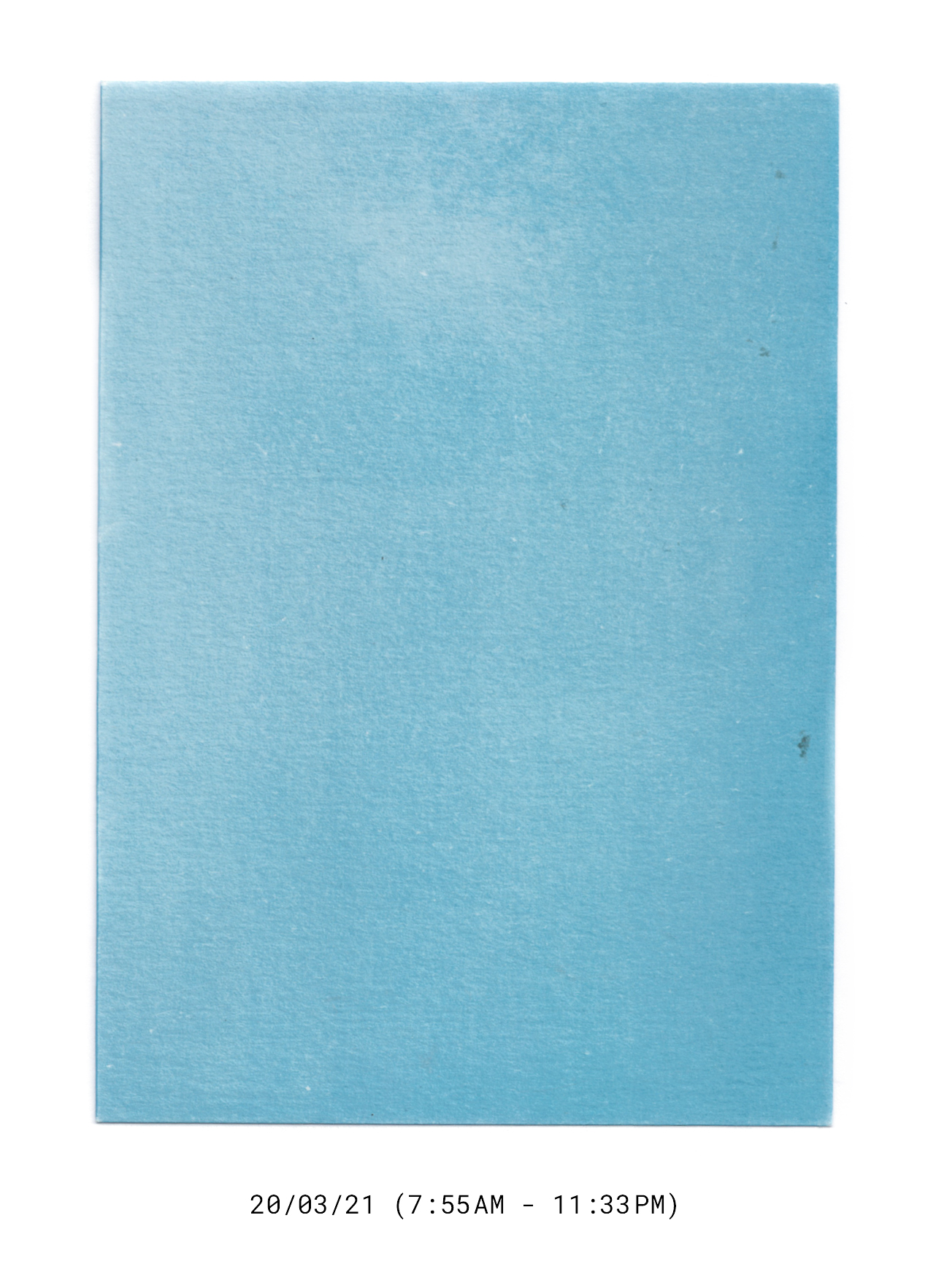
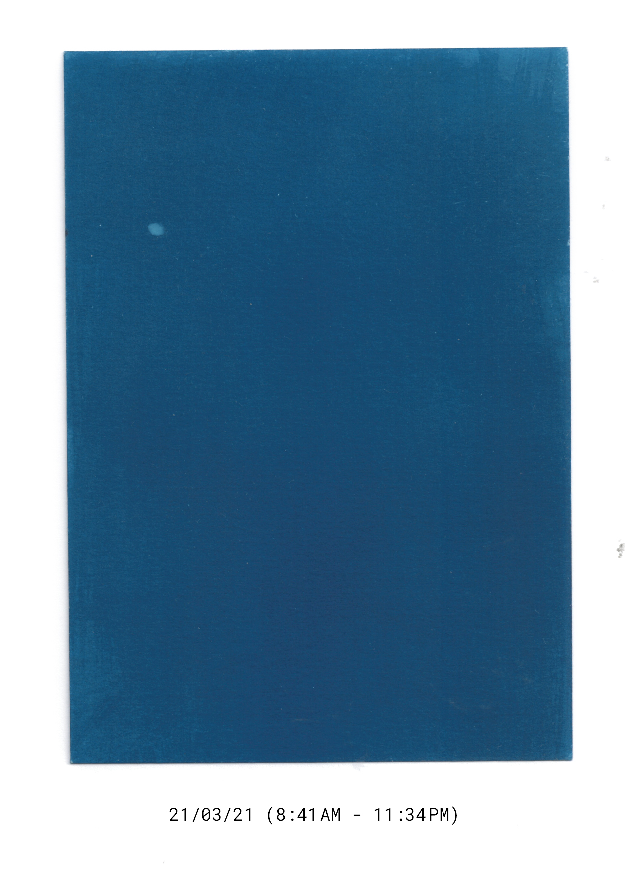
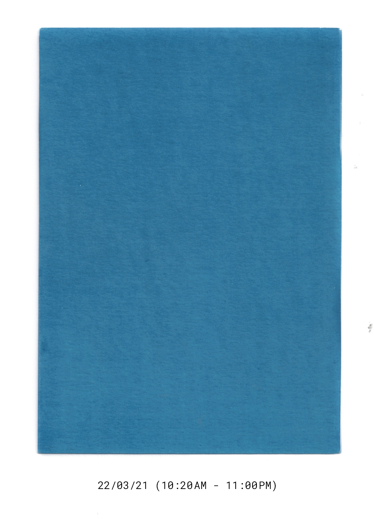
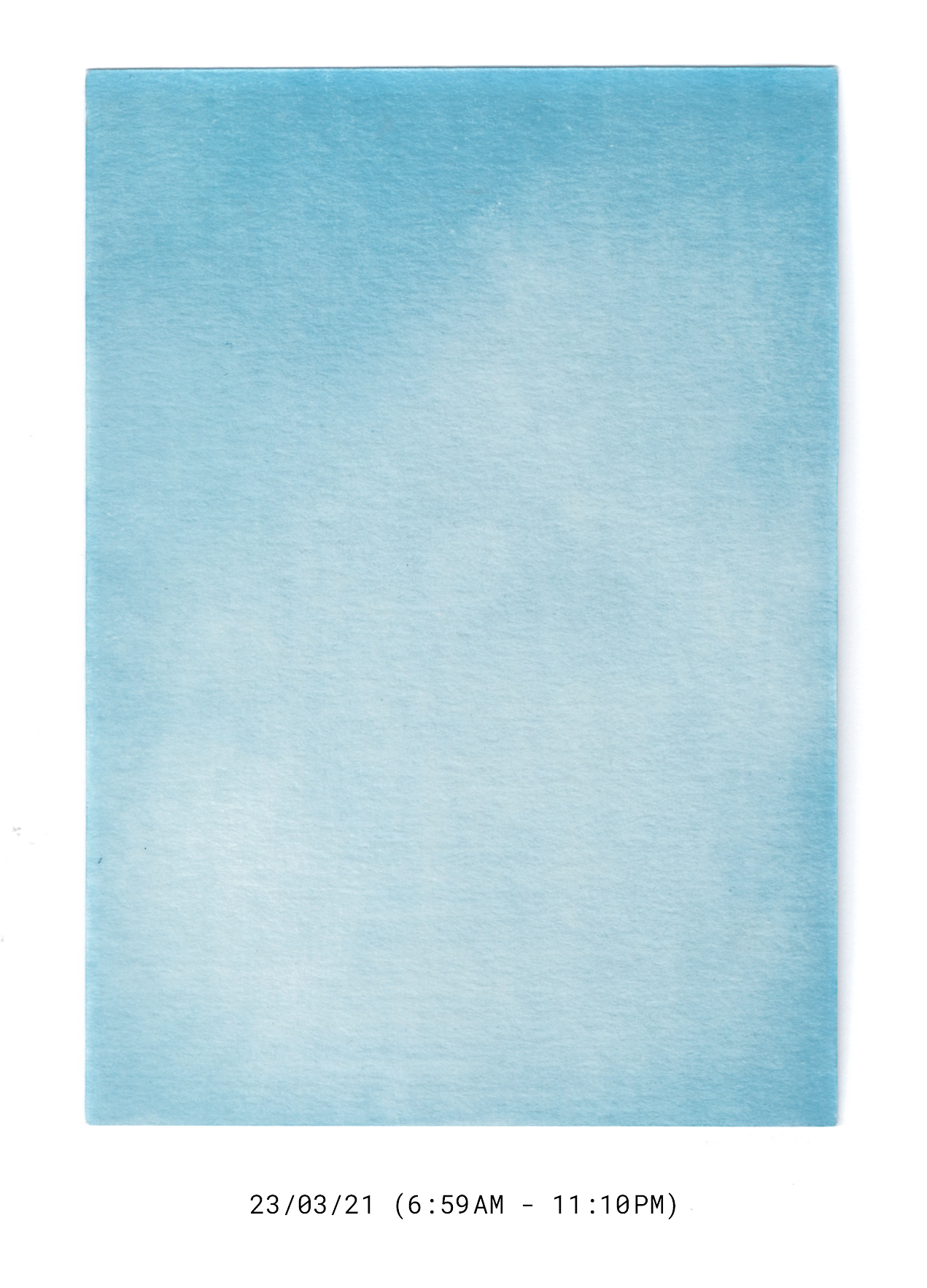
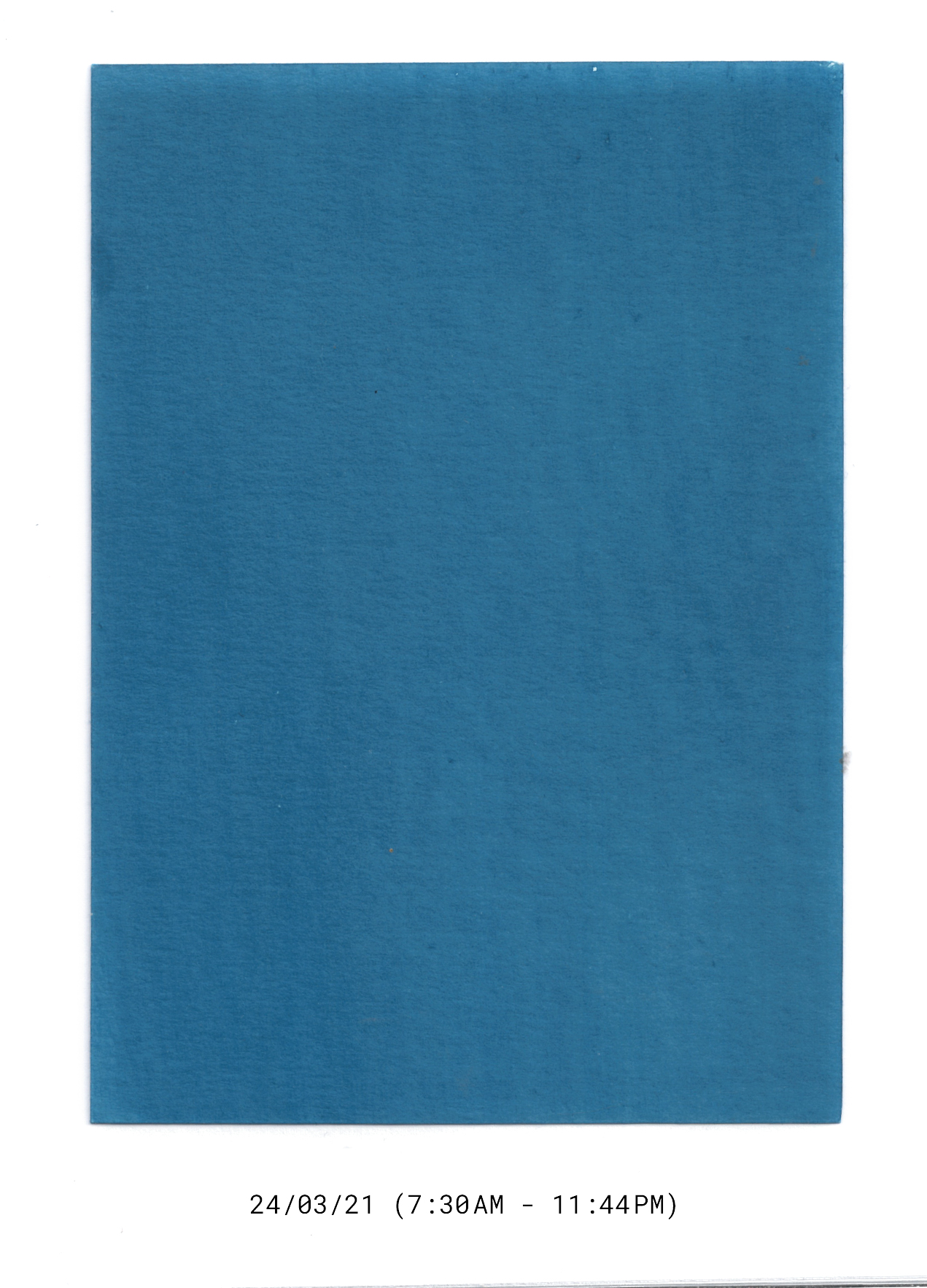
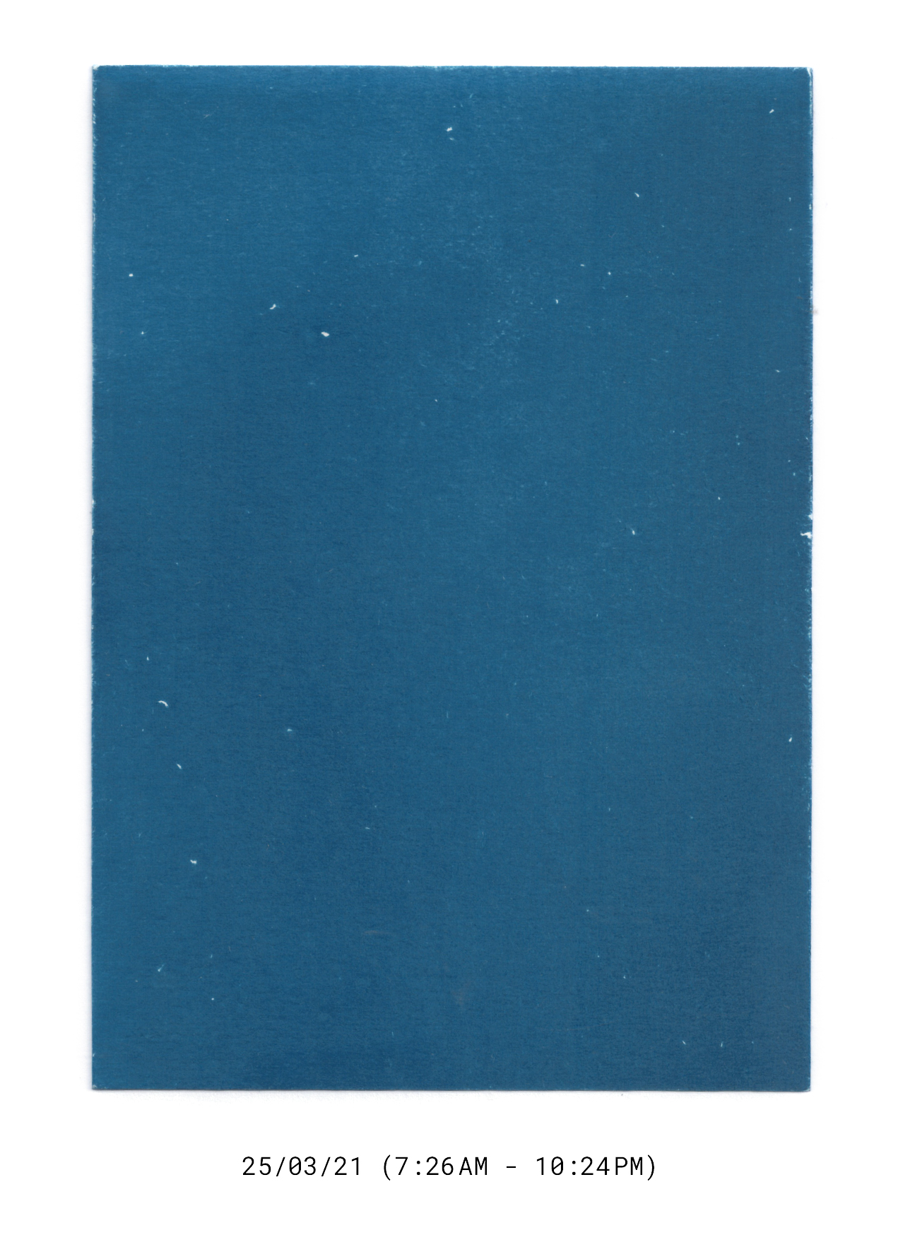

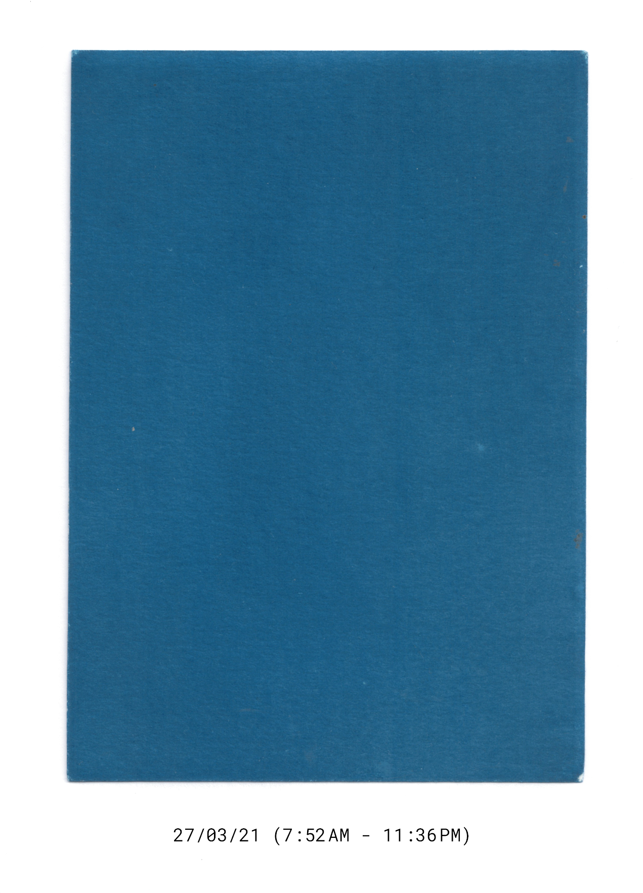
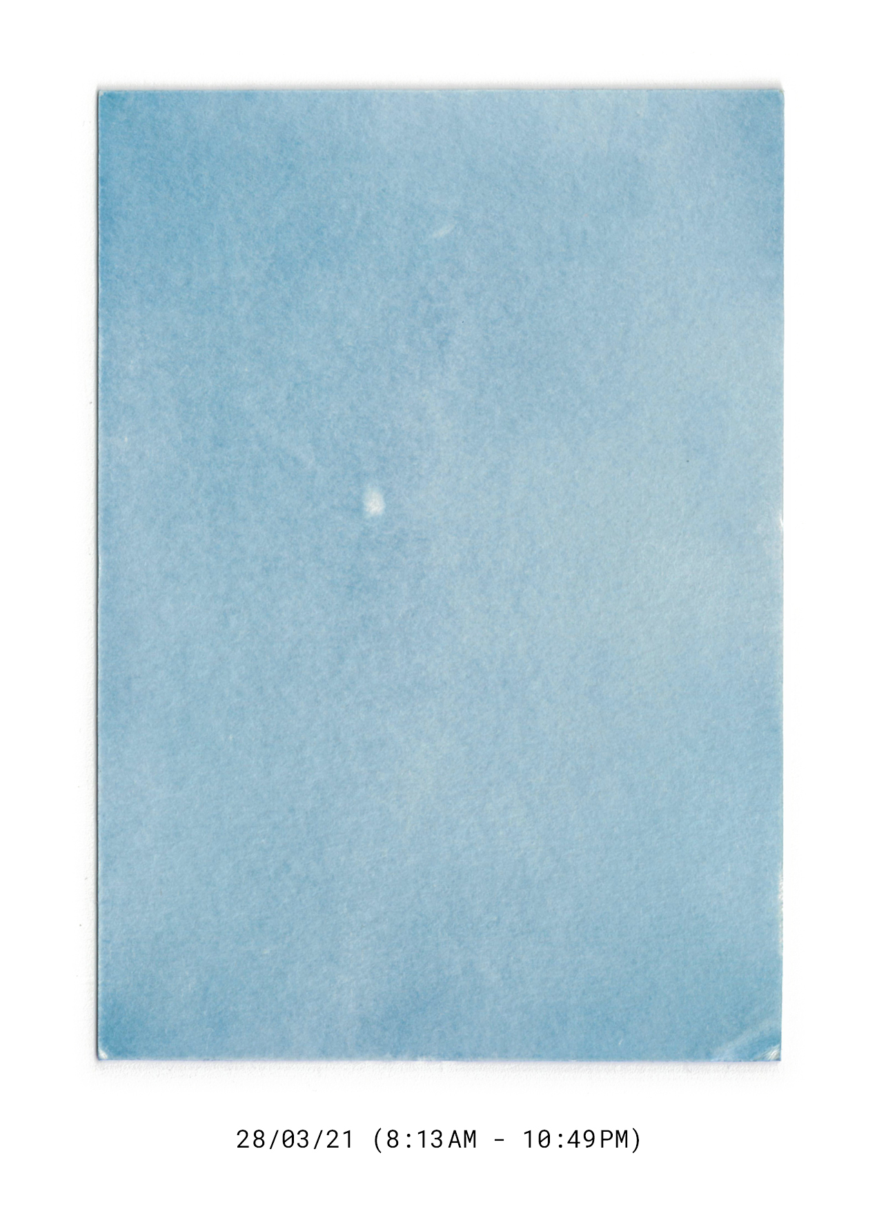
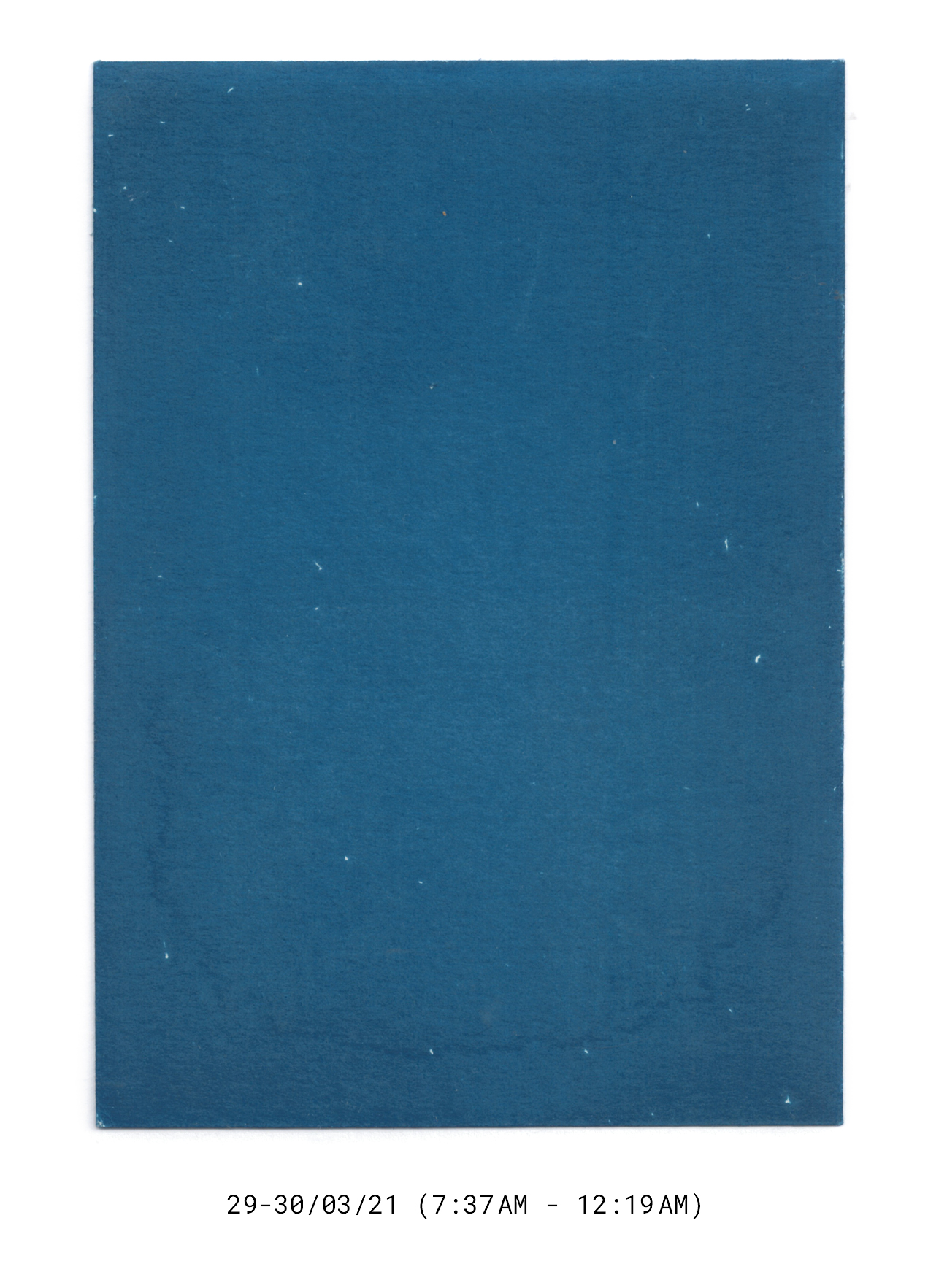
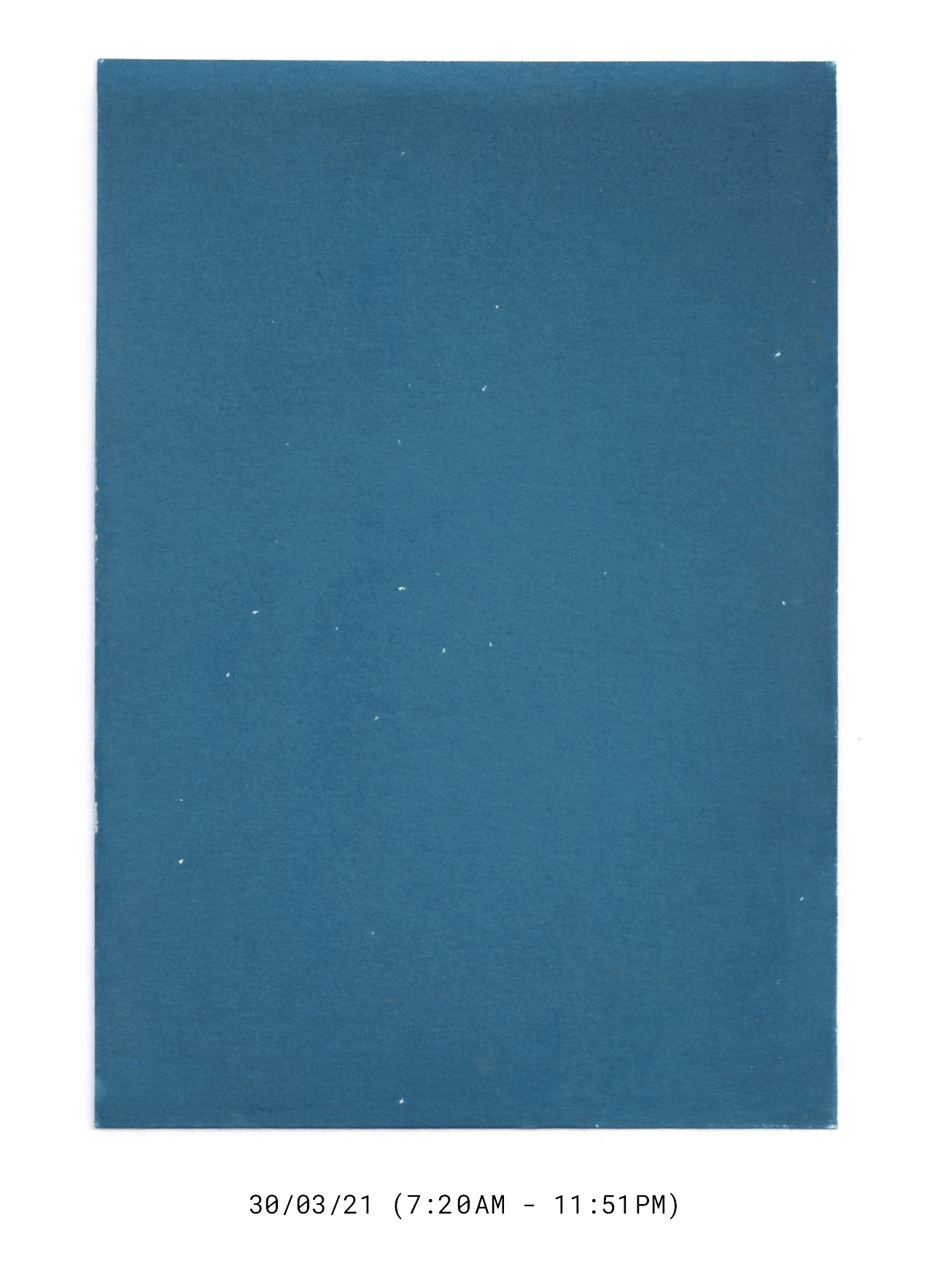
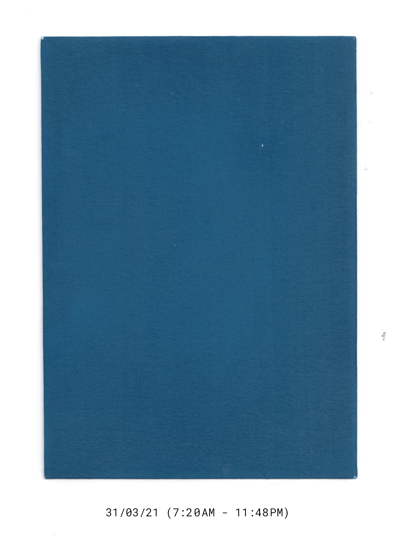
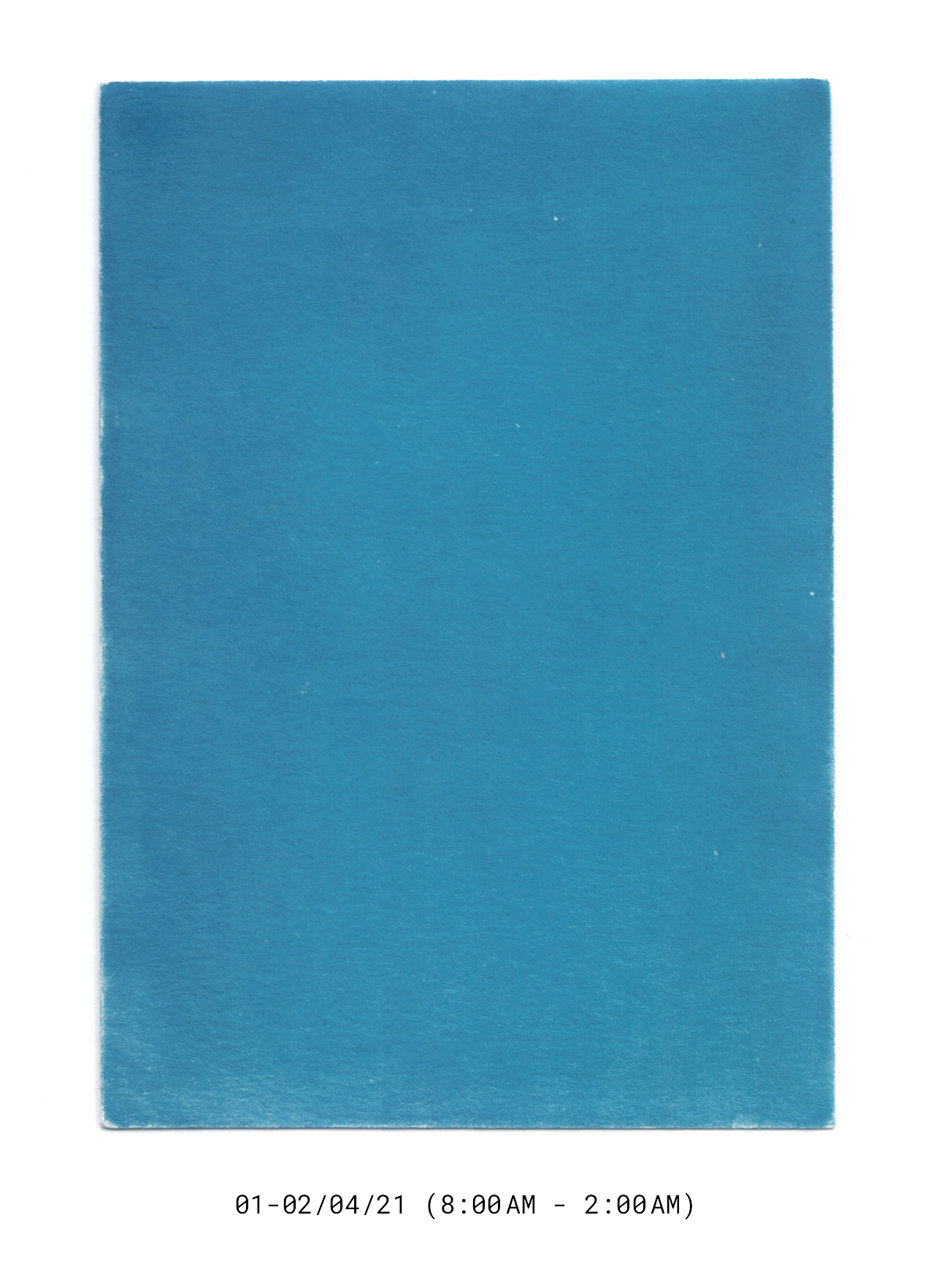
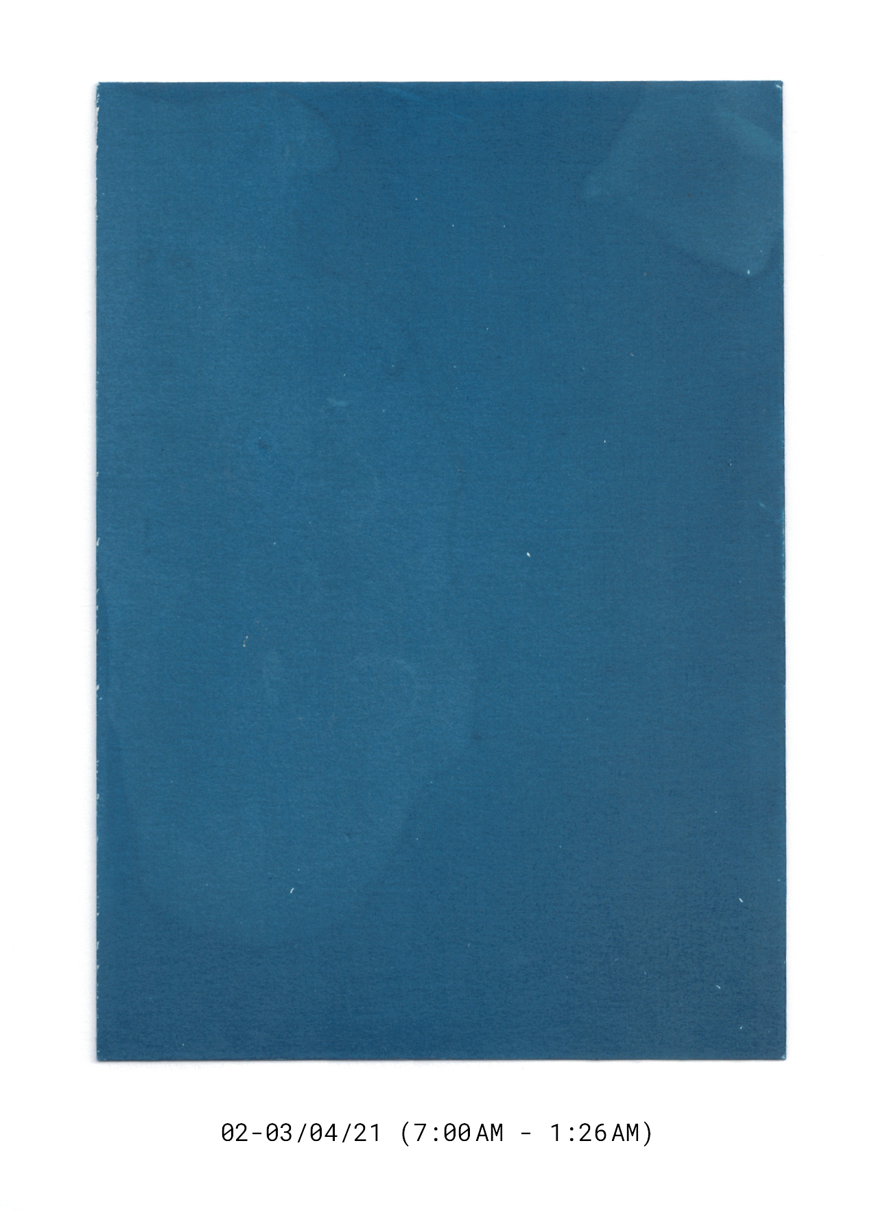
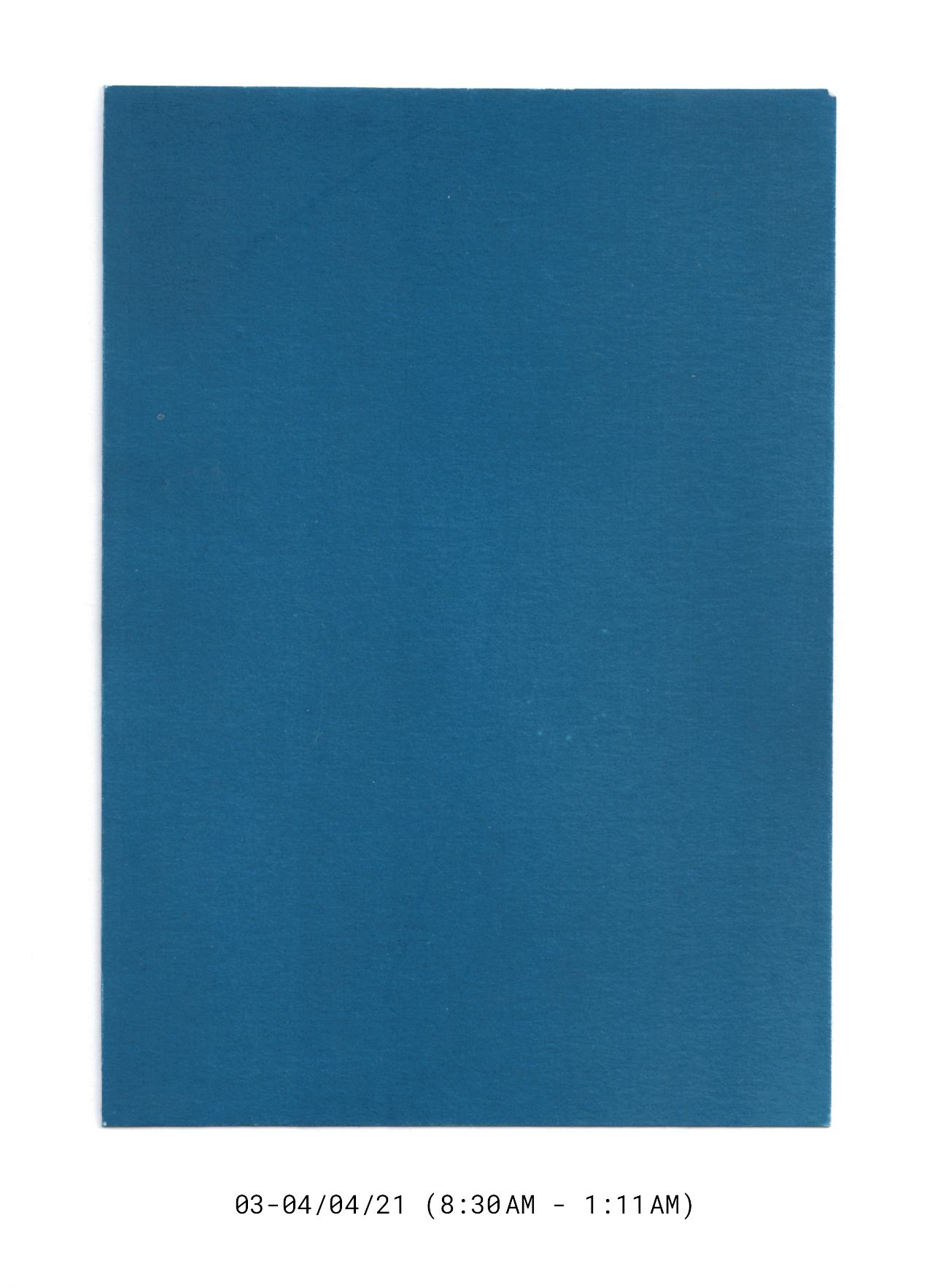
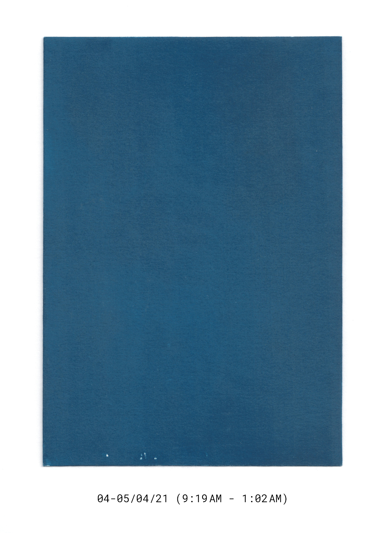
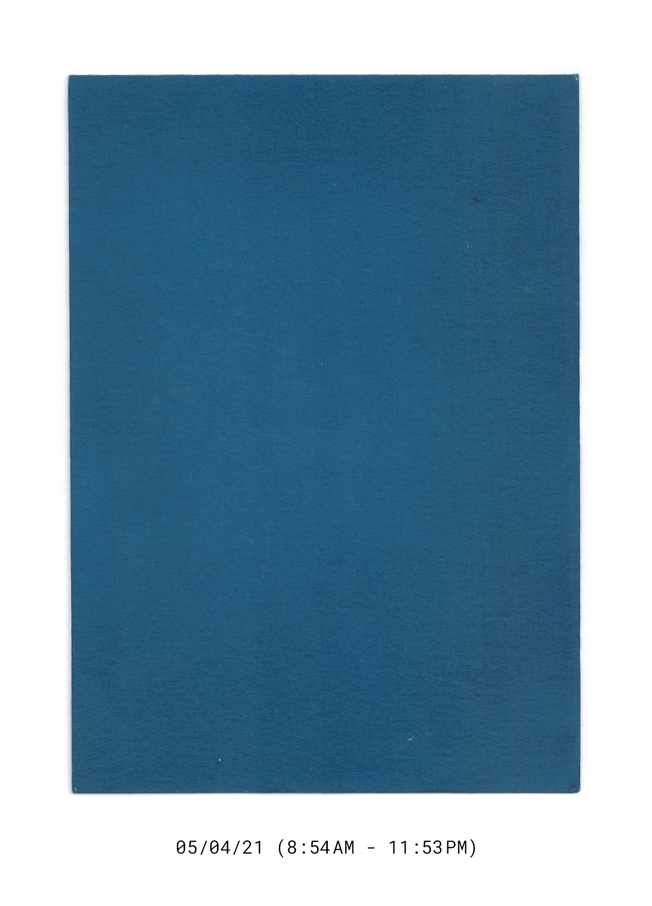
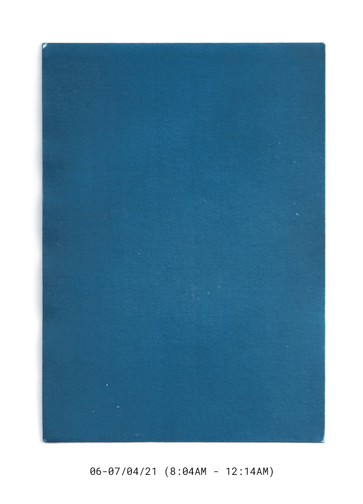
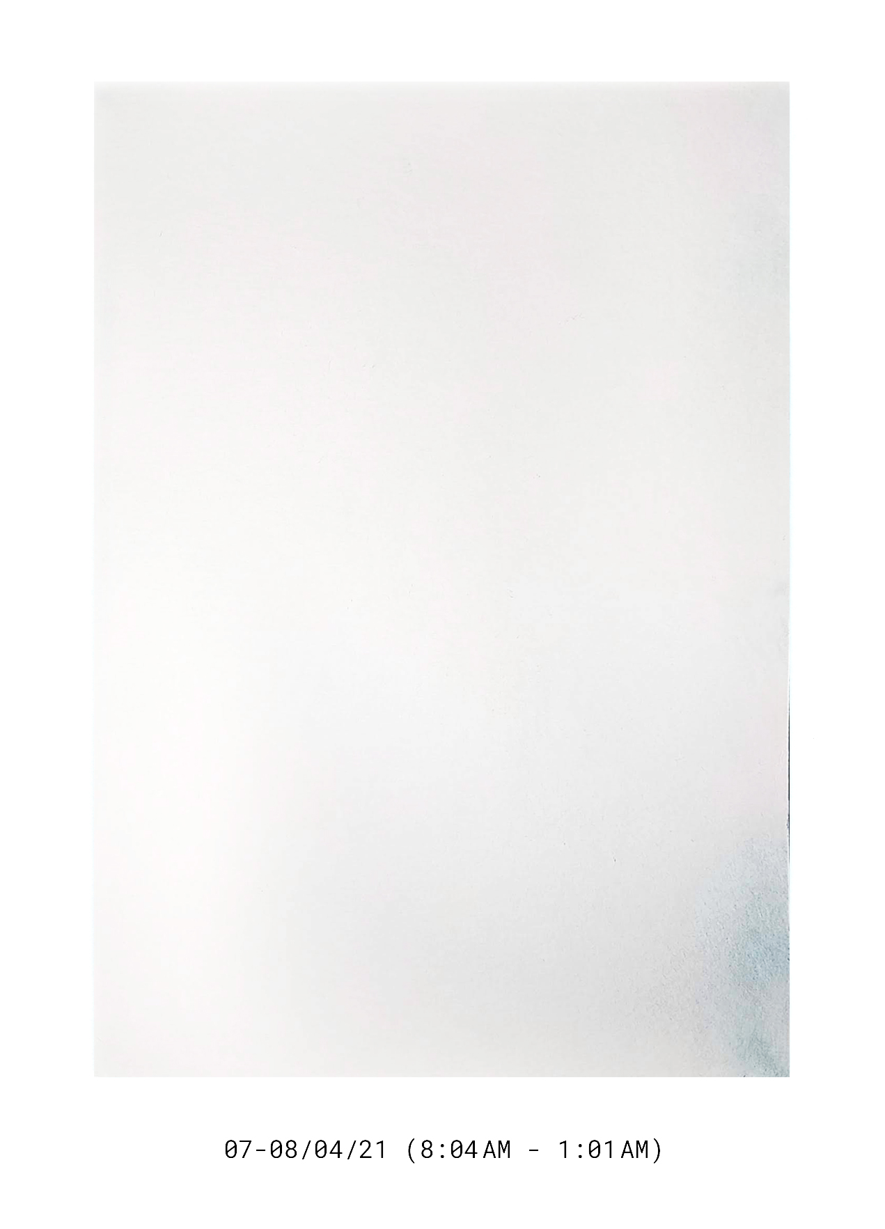

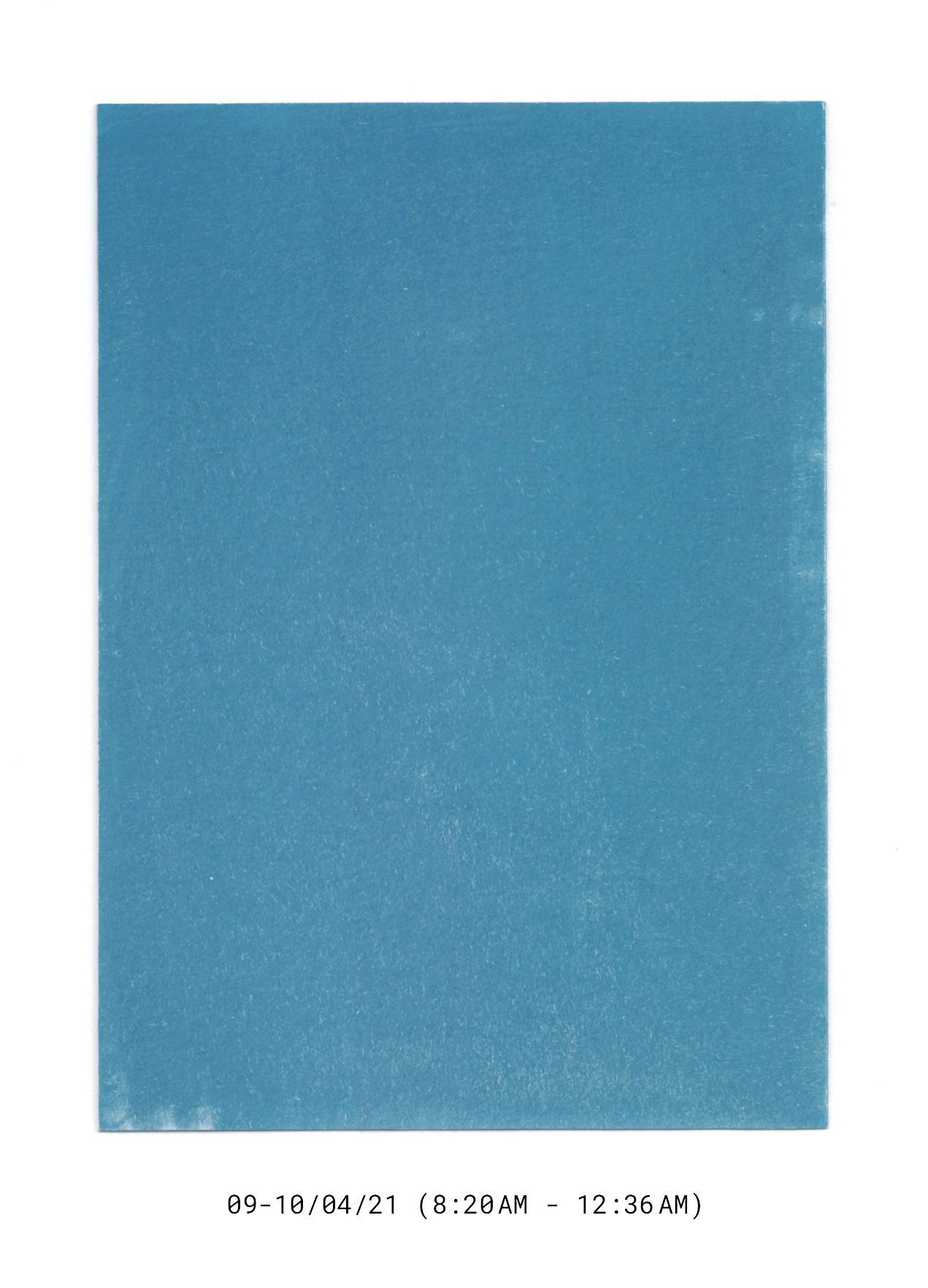
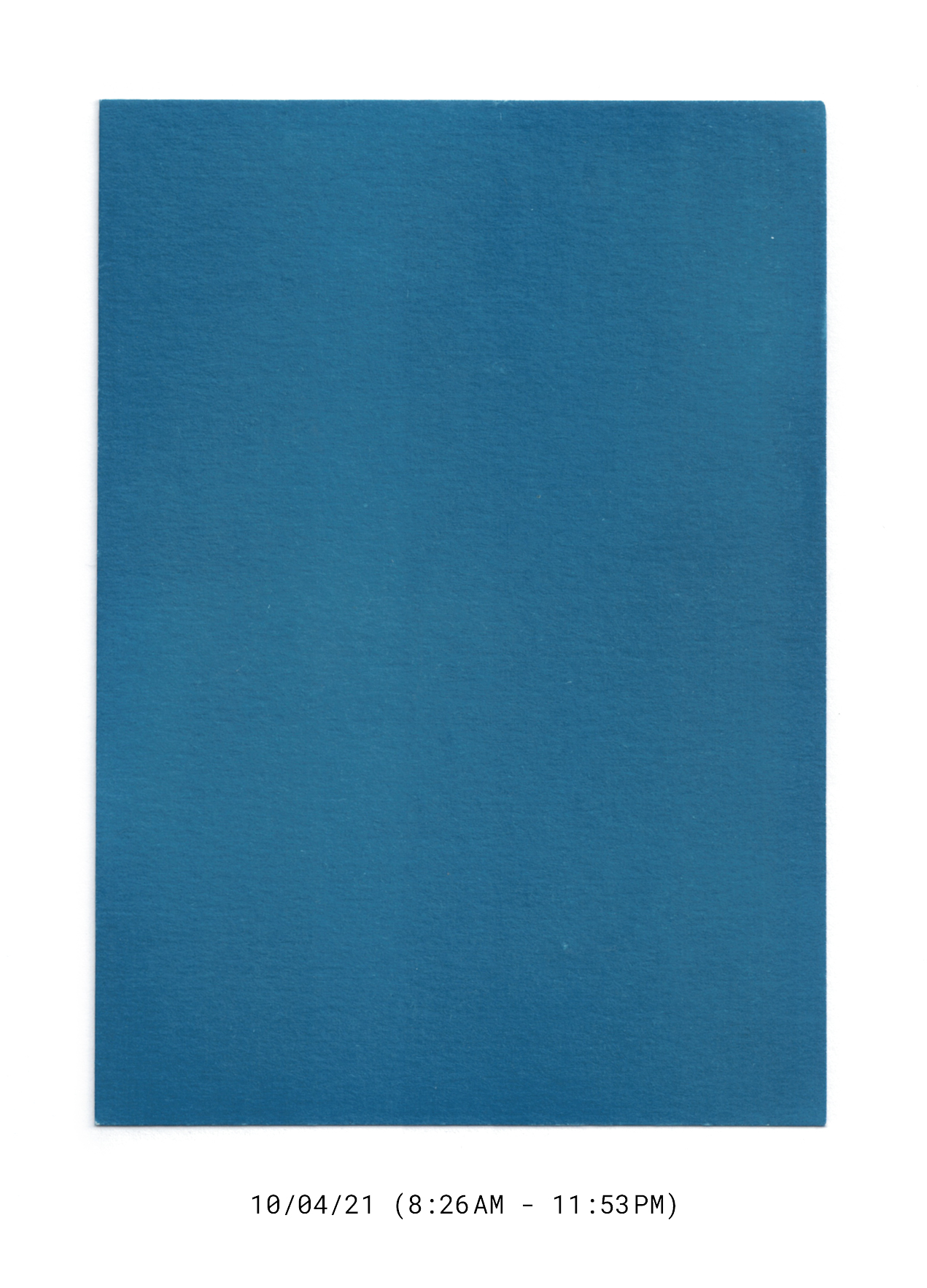
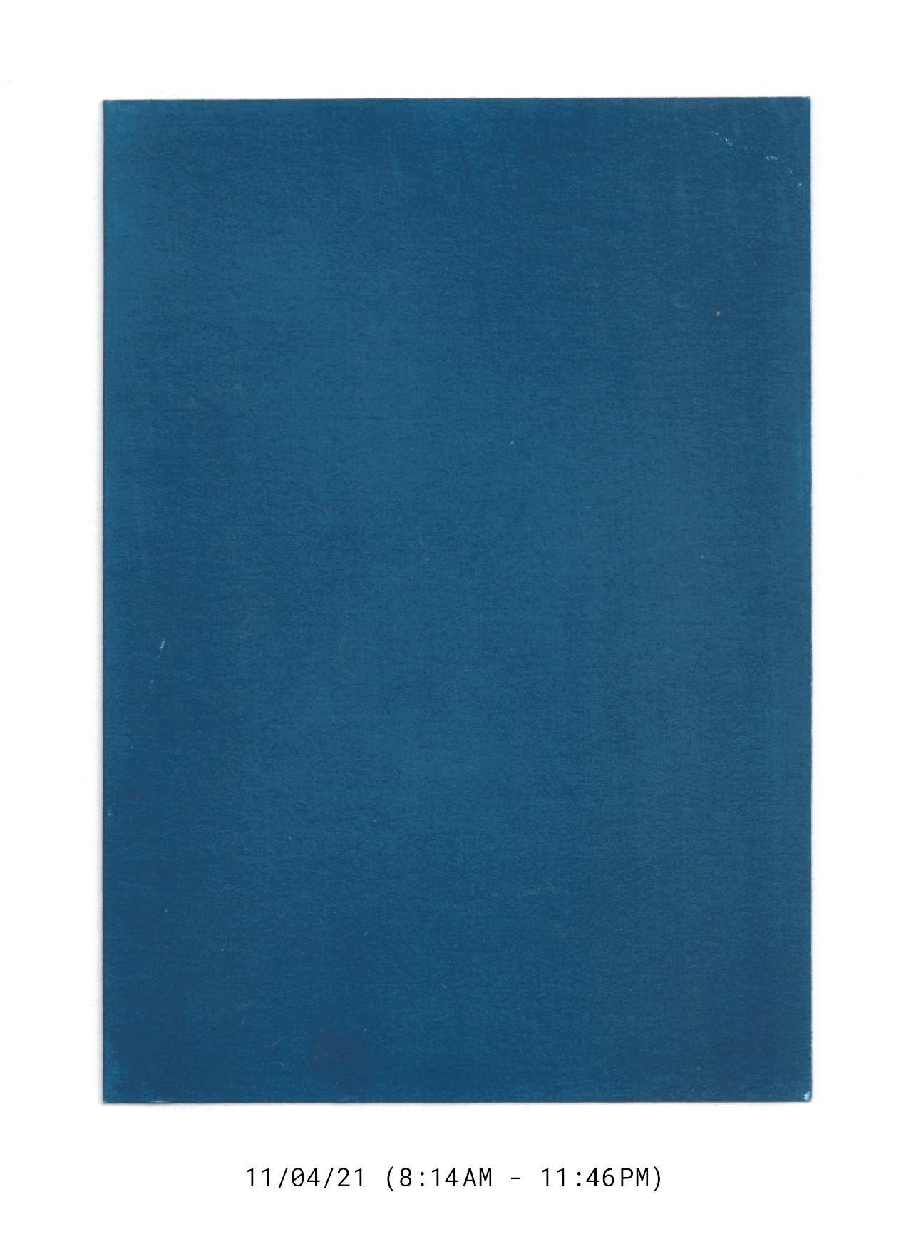
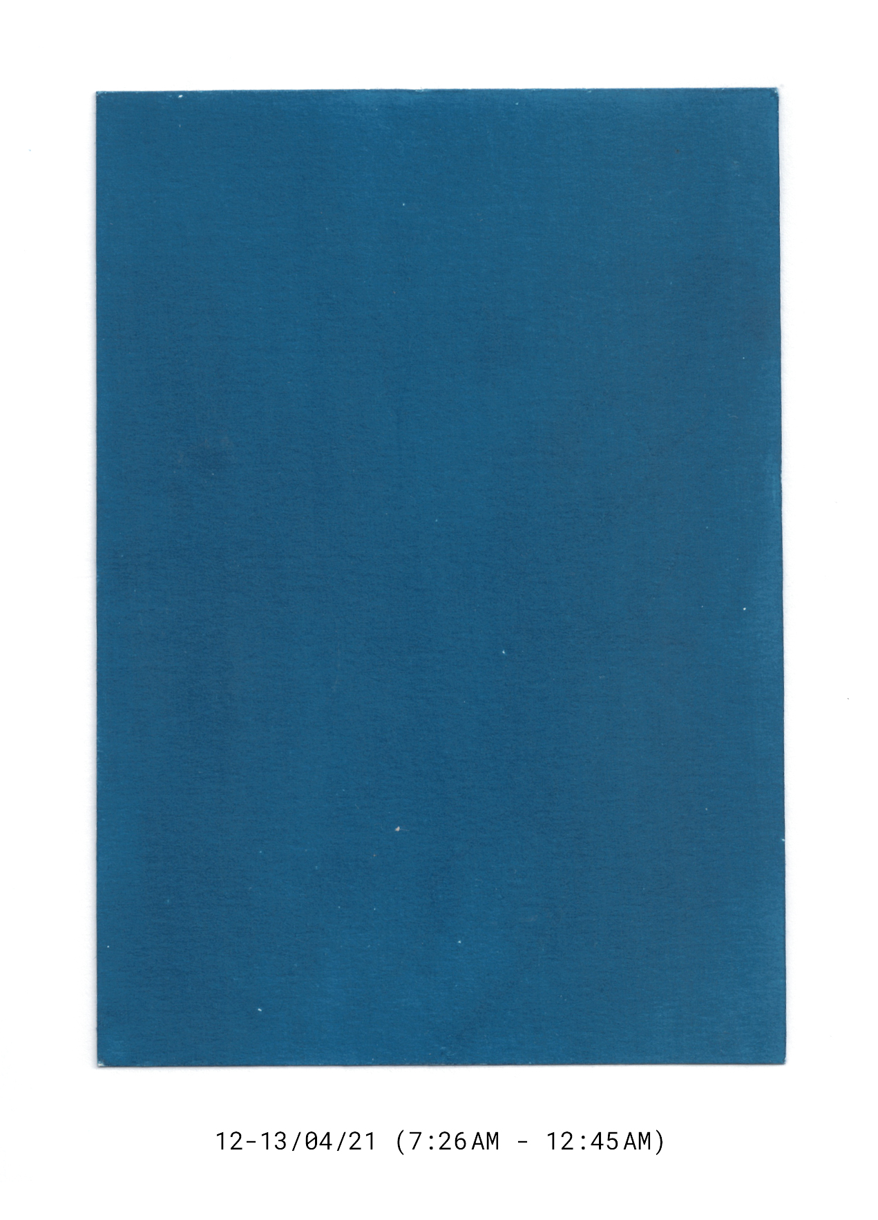
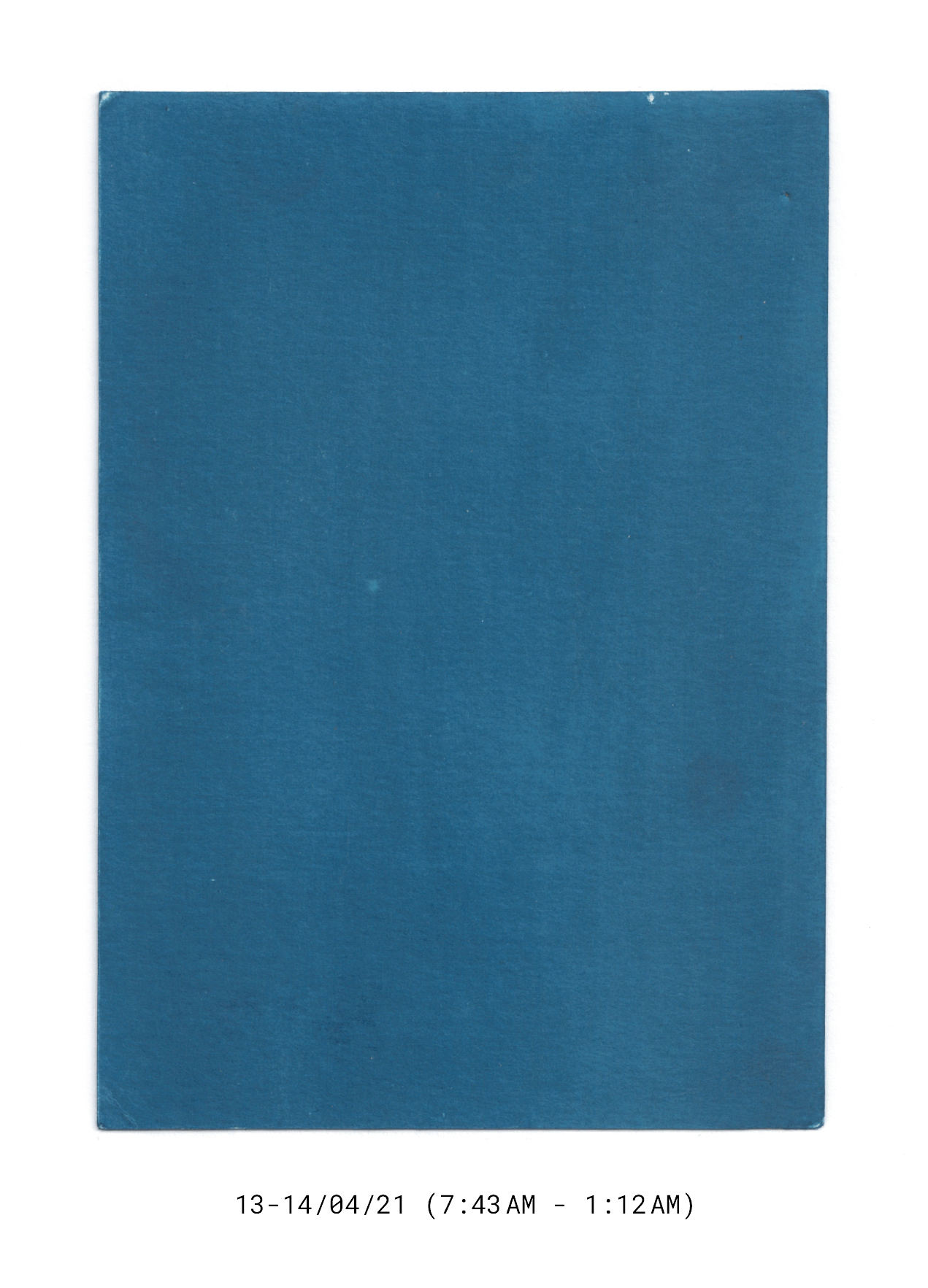
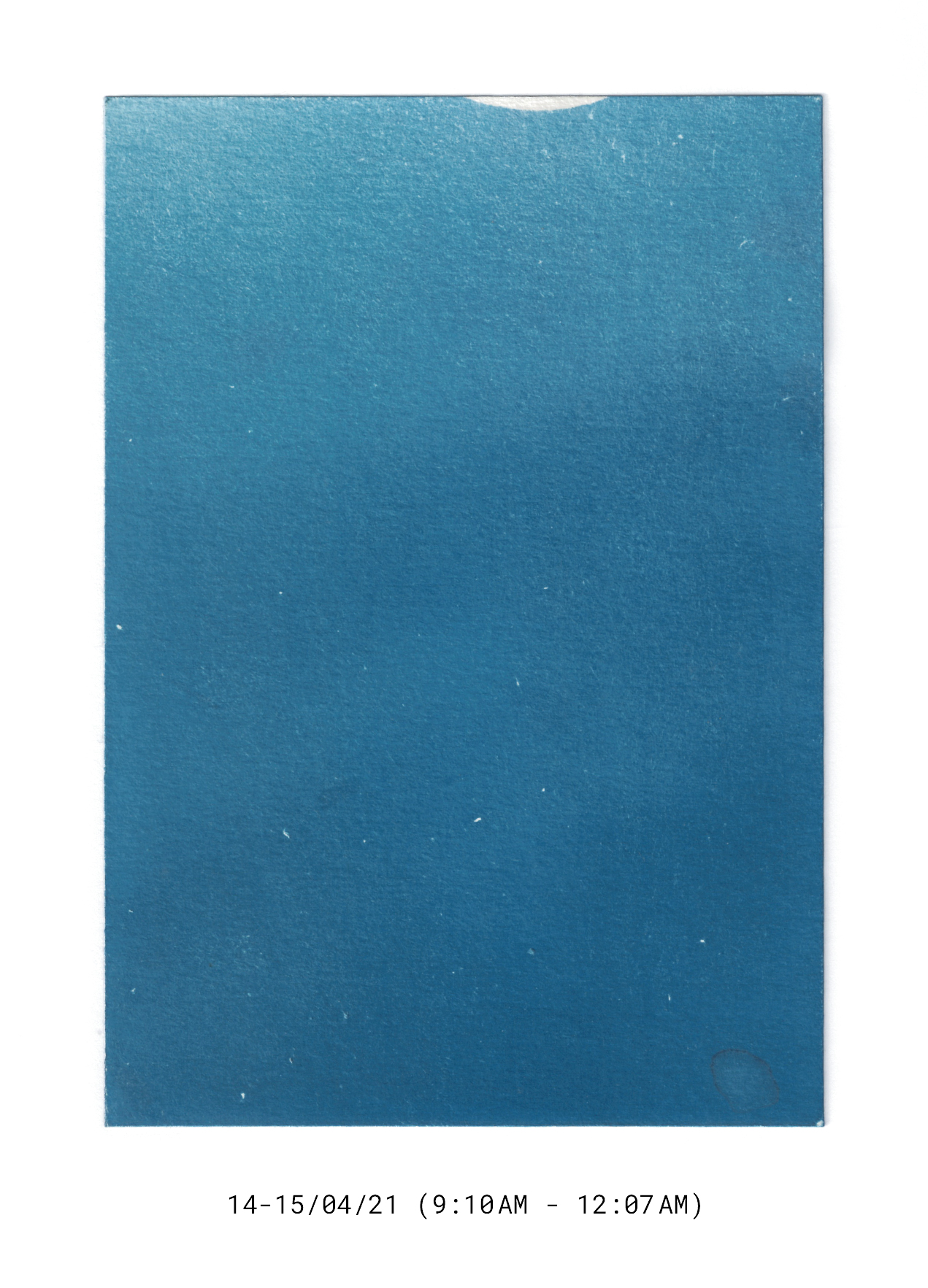
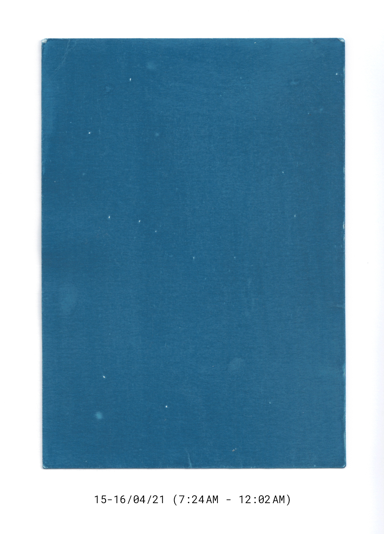
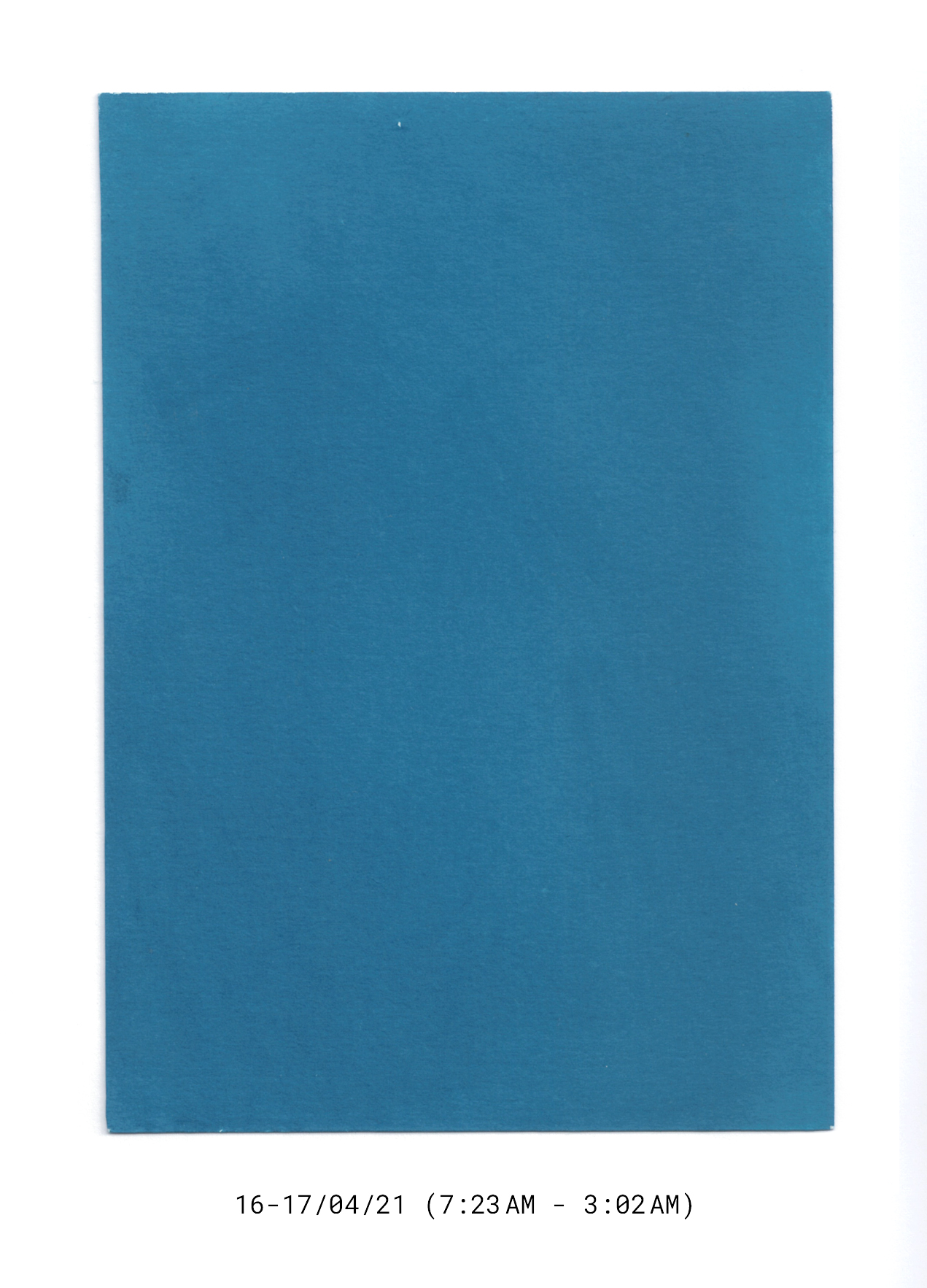
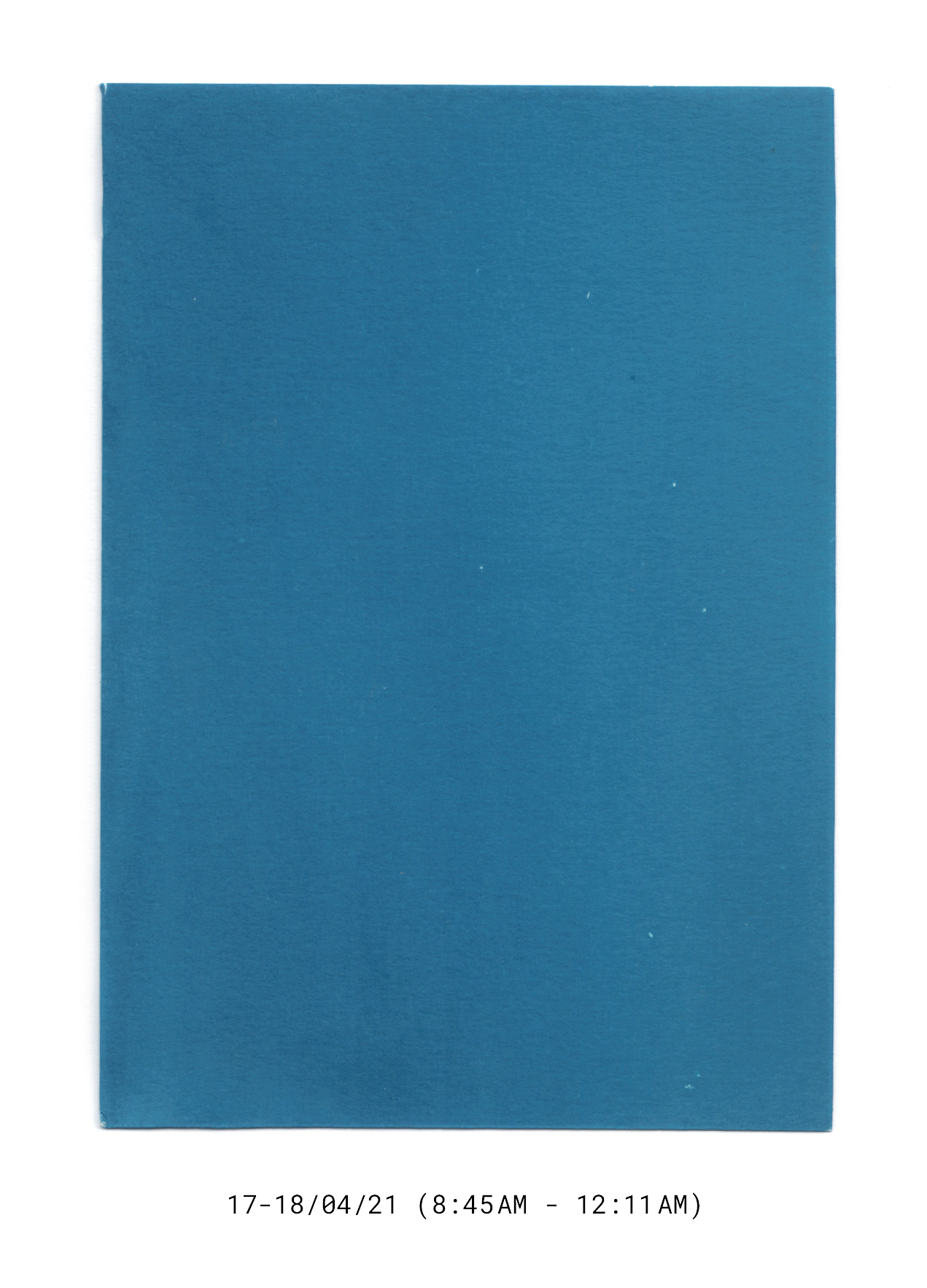
Diario (Monochromes, 18/03 - 18/04/2021)
(Concept, Photography)
(Concept, Photography)
Diario (Spanish for ‘daily’ and/or ‘diary’) is an intimate account of a month- long period spent in homebound solitude. Each monochromatic print bears the photographic imprint of all acts of domestic performance and peripheral phenomena once unfolded between the artist’s waking hours within a given day with a single exposure of equal duration (marked under each print).
The series becomes a small archive of a continuous, long-term performance that proposes an alternative to the photograph’s concrete visual re- presentation. By adopting complete abstraction, yet remaining in the realm of the photographic, the project places physical presence, anecdotal account, and material indexicality at the forefront of photographic documentation.


Soho Home+ Style Re-Launch
(Photography, Photography Assistance, Lighting, Digital Operation, Production)
A complete and comprehensive creative revamp of the Soho Home+ subsidiaries of Soho House that situates products into a space they can truly inhabit. A space that allows scale, texture, and functionality to become tangible and transparent whilst also bringing home the look and feel of being at one of the Houses.

there, then...
(Concept, Video, Photography, Installation)
(Concept, Video, Photography, Installation)
[ VISIT PROJECT PAGE︎︎︎]
there, then... is rooted in an immediate phenomenological application of Derrida’s (non-)concept of différance. It proposes the present instant-in-space as arbitrary and comparatively differential in its continuous plenitude: one knows, through comparison, that the immediate now is not then, and the current here is not there. Hence, a past instant-in-space is always carried into the present one, and will, in time, be carried into a future one, as a comparative trace (or anti-trace). Conscious experience then requires gaps or space in-between instants in order to differ from the current instant—something which Derrida calls the ‘becoming time/space of time’.
The work illuminates one’s gaze with a collection of near-still frames, ‘instants’, that sit between moving image and still photography, synthesizing the feeling of an extended present moment or event.